Saturday, June 27, 2009

The Coming Mystery Of The Missing Barrels Of Oil

We have been conditioned throughout the oil age to count our supply of energy by the barrel. And over the first half of oil's production curve that's been a fair and accurate way of doing it. But as we go through the topping of the curve, things are going to change drastically. There are two big factors that will be doing this and both are little appreciated.

The first is net exports. You have to consider that, post peak, the global production decline rate must be modified by the rising internal consumption rate by the growing economies of the oil producing nations. A rising oil price enriches the producing economies and creates growing oil demand, cutting the amount of oil they put on the market for the importing nations. This has been modeled by Jeffrey Brown, a geologist, and is known as the ELM (Export Land Model). You can read a detailed description of it at en.wikipedia.org/wiki/Export_Land_Model" but the upshot of it is that we, that is the importing nations, will be coming up short on our barrels of energy if we're just counting barrels produced as this ELM chart shows:
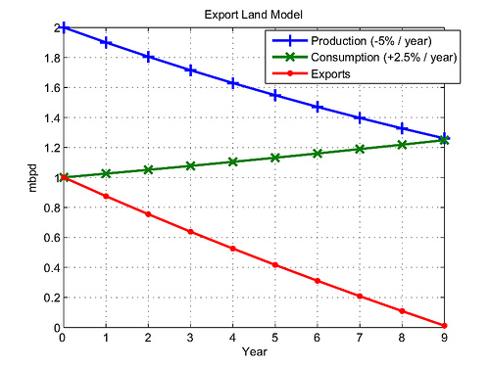
Post peak, this graph assumes a global production decline rate of 5% per year with a growing oil consumption rate among the producing nations of 2.5% per year (very close to what these two rates are estimated at). It also assumes that at peak, about half of oil produced is exported (again very close to the current global figures). If you do the math, you wind up with the red line being the amount of oil exported and see the shocking result that it goes to zero just 9 years after global peak production is reached! If we are at or near peak now, this is not good. For the importing nations, the barrels produced will become a more and more distorted measure of energy available.

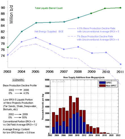
The other big factor that will distort our traditional barrel counting is net energy. For this, I refer you to my Instablog post "The Alternative Energy No One Is Thinking About". If you attempt to draw up a quantified projection of how the makeup of our barrels is changing as we approach the net energy cliff, you could draw something like this:

The green line is the physical barrel count and the blue line is a tabulation of what the actual energy contribution of those barrels is for the assumptions shown (BOE or Barrels of Oil Equivalent). It considers a base production decline rate going from 0% in 2002 to the standard 4.5% in 2008 (in a linear progression). It also considers the EROEI decline as shown both from the gradual addition of the low EROEI components such as deepwater, etc. and a new conventional EROEI of 9 replacing an old field average of 12. The estimates for the base production decline rate range from a traditional 4.5% figure to some more recent estimates of up to about 7%. So I drew two curves to encompass the range between these two figures and also a range on the average EROEI of the added unconventional liquids of between 4 and 5, sort of a best and worst case scenario with these estimate ranges. Both curves consider the new projects additions as shown.

This curve along with the ELM may help explain how, even as we continued to ramp up world production by barrel count about as fast as world demand, the pricing of oil started to go crazy after about 2005. It started as real supply/demand imbalance that attracted a lot of investor heat. It took the end of the civilized world and a collosal fund catastrophe and recession in 2008 to halt it. But one has to wonder just how severely it is going to reheat.

The 6% or so base production decline rate may prove to be overly optimistic. So many of the elephant oil fields have been produced with high water injection, fishbone drilling, and other volume enhancing methods, which induce sharp production falls when the peak is reached, that the older model 4.5% figure may not be realistic when many of the elephants go into decline. This was discussed at Jim Kingsdale's Energy Investment Strategies site (Sept. 1, 2008) where he stated, "When Ghawar declines it may well follow the example of another giant old field that had extremely high artificial pressurization efforts, Cantarell. This Mexican field has been in decline for a couple of years and it is now declining at the alarming rate of 36% per year. The current estimated global decline rate - whether 4.5% or 5.2% - assumes flat production at Ghawar...". I somehow suspect that when Ghawar, and the other elephants, water out, the production will definitely not be flat.

Sunday, June 21, 2009

Sugar - White Gold Of The Post Oil Age?

Corn ethanol's popularity has come and mostly gone in the U.S., but the 60% of global ethanol use that's sugar based is still marching on. The low net energy problem of corn ethanol (EROEI about 1.3) may be fixed by the cellulosic ethanols being worked on, but meanwhile, the near oil-like net energy of sugar ethanol, as produced by Brazil anyway, make this renewable fuel the oil replacement of choice. Ethanol solves the CO2 problem because, as your high school chemistry should remind you, plants absorb CO2 and give off oxygen. When plants are burned for fuel, they give off CO2, so they are about carbon neutral.

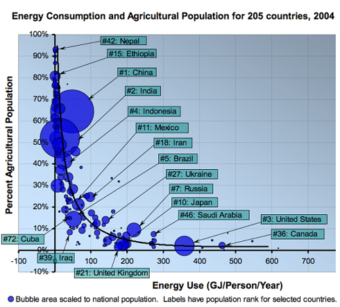
The problem for sugar is that where it is most needed (like North America) it's hardest to grow. And where they can grow excess tons of grains in general, including lots of sugar, they don't have the advanced economy to use it all as fuel. There is a pronounced inverse relation here that was charted by Stuart Staniford recently: (click to enlarge)

The blue blobs are the world's population centers and, as you can see, they tend to be very agriculturally oriented people who use very little energy. At the other end of the curve are the industrialized nations where there are fewer people but they use much more energy. One can envision a happy, massive export/import situation emerging for something like sugar that can effectively replace oil.

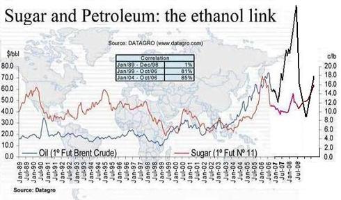
There is clear link developing between oil and sugar:

As the correlation table shows, there was no correlation until the oil price climb began around 2001.

Jim Rogers was quoted at an investors' conference about a year ago as saying, "Buy all the sugar you can". He likes agriculture in general, but sugar in particular. I don't know how much of this ethanol link he is seeing in that, but I can understand why he is busy buying up farming operations around the world, saying that it will be the farmers, not the leveraged buyout artists, who will be driving the Maseratis of the future.

Saturday, June 20, 2009

The Best Market Advice Is Free

One of the most perplexing problems for a stock picker (as opposed to a market analyst) is knowing when to be aggressive and when to be defensive. Bottom up individual stock analysts like me ask nothing of the overall market. The ideal market for us is perfectly flat, not interfering with our individual stock dynamics at all. We don't like overbought or oversold stock markets fretting or celebrating anything. But in the real world, market stampedes trample our well thought out analysis right and left. So we have to be something of a market caller whether we like it or not.

So how do you best do this? Well, you could try to figure it out yourself, but if your talent is individual company prediction, you're likely not very good at calling every market turn. There are people that make it a full time job to study nothing but the market turns and you must pay them for their advice if they have a good track record, and a few of these are good enough to keep you on the right side the vast majority of the time. But even the ones with the best records will lead you into a lot of unnecessary market dodge ball at best and they often lead you right into big market debacles.

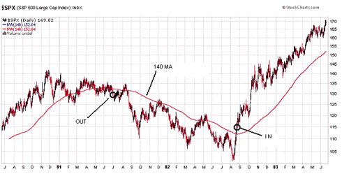
There is a very unsophisticated way to stay on the right side of the market. If you look at about any 20 or 30 year history of the market, you observe that if you simply stay away from the market when it's below the 140 dma, you avoid about all the disasters. That's because the vast majority of damaging downdrafts are economic trend induced and thus they come on gradually and advertise their arrival very well with moving average crosses.

If you take the period from 1980 to now and let Doctor 140 be your highly paid advisor, you would start out something like this:

If you allow about two months after a cross below the 140 to see if the market takes up residence there instead of just spiking below it, this can filter out a lot of noise, but it's a little subjective as to when a brief dip justifies a lot of selling. Usually, when a major average spends most of two months below a 140 (or 200) cross, it's a negative signal. Dialing a portfolio back in can begin when a forceful cross is seen that doesn't immediately come back down.

The S&P 500 over this period went from 115 to about 900 now. That's a 682% return. Just doing a rough hand tabulation of what a fund would have done had you done nothing for market advice except listen to Doctor 140, I get about a 1290% return over the same period. That's if you would have only matched the S&P 500 while in the market!

It would not have kept you out of the crash of '87, but nobody is perfect, and Doctor 140 is more perfect than most.

Friday, June 19, 2009

The Alternative Energy No One is Thinking About

In the panoramic view of all the new age, post oil age, energy we are going to need, there is one that perhaps is more important than all the rest. But it receives no hearings in Congress, no subsidies, and little consideration in energy policy plans. Yet it is probably the single biggest post oil age alternative we will need over the next 10 to 20 years.

This is simply the "new" energy we did not have to spend in past decades to recover the old energy. This may not sound like such a big deal at first. But when you look at the math, you see much more of an energy crisis brewing than just peak oil itself.

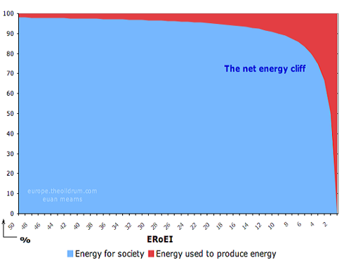
The above chart, a purely mathematically calculation, shows basically the progression of our oil age in terms of net energy. We enjoyed an Energy Returned on Energy Invested (EROEI) ratio of an estimated 100 or so when you could just poke a shallow hole in the ground and be handed an ocean of energy. Of course it got tougher as all the elephant, easy to develope fields played out and oil got much more difficult to recover; and now it's running around 8 to 12 depending on whose tabulation you go by. But look at what happens in the above chart as you go below about 6. EROEI becomes a game changer.

Not only is EROEI a game changer for oil, it is of paramount importance in developing all forms of oil-age alternatives - ethanol, solar, everything. Anything with EROEI less than about 3 is virtually useless in replacing oil. And even oil will become useless in replacing oil when the EROEI goes 'round the bend in the chart.

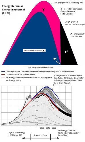
This translates into an "EROEI adjusted" Hubbert's peak that would look something like this:

Most all of the nonconventional liquids being added to the conventional curve (which peaked in 2005) such as tar sand oil, deepwater oil, and most of the bio-fuels are very low EROEI and do not contribute as much to the total energy curve as usually depicted. The last half of the net energy production curve winds up looking vastly different than what we have been spoiled by for decades.

The implications of this growing net energy effect are probably more upward pressure on oil prices than what most projections see that just add up barrels from new projects, factor in field decline rate (in barrels) and basically treat all barrels the same. It also means driller demand will grow exponentially as we go around the bend in the above chart.

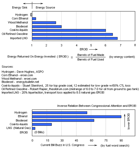
As we head toward the edge of the net energy cliff, we have just a very limited window of time to stop the corn ethanol and other EROEI challenged foolishness and seriously develope energy sources not already near the bottom of the cliff. EROEI should be a prime focus of attention in Congress, but sadly it is not. In fact, as the following chart shows, the law makers and money spenders are actually looking the other way when it comes to the net energy cliff in front of us.

Thursday, June 18, 2009

Is Dull And Boring The Next Big Thing?

What are the two most unpopular towns in the market now? Without thinking too hard, you would likely say defensive foods and Obamanomics healthcare. Well, think again. They are both high safety ghost towns the crowds have fled in favor of recovery cyclicals and technology. But in the stock market landscape, a crowded town is a dangerous town.

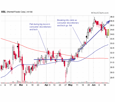
Cramer was pointing this out on his show yesterday. He was saying you might want to stay away from the popular, crowded themes and take a look at the deserted towns. If you do that, you see an interesting turn taking place in the market. You can go through a sampling of food stocks and see this:

The big, safe food and beverage stocks were conspicuous by their absence from the March/April rally. But now it's the revenge of the nerds. The chart here is for Hormel, but you see a similar thing for GIS, DLM, RAH, K, HNZ, UL, etc. The healthcare stocks show a definite group thing going on as well. They very typically look like this:

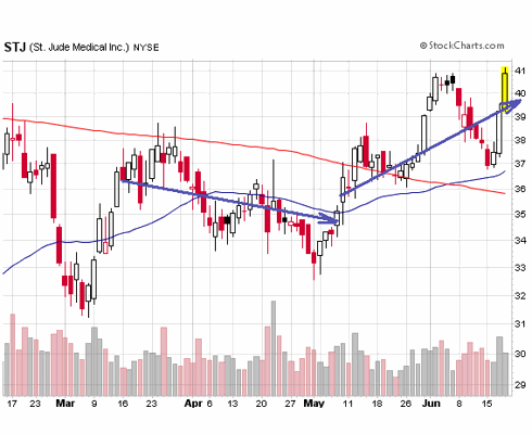
They have perhaps already been beaten down anticipating some of the worst case scenarios from healthcare reform and are ending their doldrums just as the discretionary and tech stocks go into their current consolidation. The chart is for St. Jude Medical, but you see the same thing for AMGN, STE, AMMD, CRL, and others.

What are we to make of this? Well, maybe we shouldn't feel so lucky like the punk in my previous post. Maybe we should avoid the dangerous, crowded rally darlings for now, at least until we see which way the XLY and RLX break from the consolidation they've been working on for a month and a half. In the meantime, the crowds seem to be finding their way back into Dullville.

Tuesday, June 16, 2009

Unprintable Money

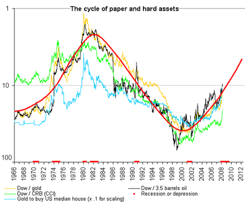
The price of oil is climbing but we're not using that much more of it right now because the economy is so weak. The reason, of course, is that they are trading printed money for money that, as Dennis Gartman is fond of saying, would hurt if it fell on your foot. That's the way it has always been and always will be. And it tends to run in historical cycles:

Those who say the bull market in commodities is over are probably wrong. This chart suggests that we are maybe half way through the current substitution move of stuff for paper, as it normally progresses. But that was before the credit debacle had the dual effect of setting the prices of commodities back nearly to levels at the beginning of the commodity bull and inducing the unprecedented money printing spectacle we are now witnessing. Throw in the rise of India and China as insatiable consumers of commodities, and we may be setting the stage for a monumental sling shot catch up trend of stuff for paper substitution such as the world has never seen. Oil had been reset to $30/bbl and nat gas to $3 and change - prices they haven't traded at since 2002, and now they have dumped this humongous load of paper smack dab on the 10 "yard" line in the above chart. The may have to call an unnecessay roughness penalty on the upcoming move in commodities.

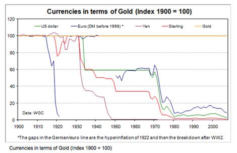
The chief unprintable money is gold, and for good reason. The following graph shows a value comparison between the barbaric metal as money and the world's various bills as money:

Every shakeup that comes along results in more paper money going by the way side. I would hazard a guess that our current problems will result in a big gold and stuff substitution for printed money.

Monday, June 15, 2009

Welcome to "Good Stock Investing"

This is a "beta" blog (under construction) for stock analysis. I write a blog at seekingalpha.com and you can read my posts there. Just put my name BrucePile (no blank space) in the search bar there. They call the blogs there "Instablogs".

I plan to do write ups on stocks as well as some sector and overall market analysis. I have basically been a bottom up analyst just picking good stocks, not a big market timer. But, in the School of Hard Knocks, I am learning to be a market analyst as well. I will design a header with some more up-to-date fund performance charts (I have widened my lead on the S&P 500). I also want to make research resource information a major feature of the site. So much of the information on the web is DRIP (Data Rich Information Poor) that I feel a valuable service is rendered by anyone who sorts the junk out.

Please be patient with the development of the site.