Saturday, January 30, 2010

Will Rising Interest Rates Kill The Gold Bull ?

The whole flap this past week over possibly replacing loose money Ben Bernanke with a dollar defender like Paul Volcker makes one wonder just what will happen to gold when the interest rate handle is eventually cranked. There are two possible investor reactions: "Oh my, they're going to defend the dollar, I'd better sell my gold" or "Oh my, there's an inflation threat, I'd better buy some gold". Most of the commentary I've been seeing tends to be of the first type - if they start to defend the dollar, gold will go down.

What happened as the previous gold bull came to its end in the 1970s? Well, if you chart the two, the USD vs the prime rate over the end game for gold's bull market back then, you see this:

Clearly investors seemed to be thinking more along the lines of choice #2 above - rates and gold responding in unison to an inflation threat. The interest rate climb, which took place over nearly 10 years, ignited gold from $35 to $850. The dollar eventually did a huge climb to match the interest rate climb, but this was many years behind the rate climb - beginning in 1980 and peaking in 1985.

In our current situation, we have not even begun to raise rates, which suggests an even more powerful climb ahead for gold than we have seen thus far.

Wednesday, January 20, 2010

Gold and Dollar Going Into Decouple Phase ?

Gold bulls are fretting what looks like a dollar rally with legs that could go on for months. And of course everybody knows that if the dollar goes up, gold must go down, right? Well not so fast. That is the usual correlation, but what if I told you that it was possible for the dollar and gold to both be in a bull move for a year's time? Impossible? Well, it has happened twice in the last 10 years:

This spans from Dec. 2000 to Feb. 2002 and both gold and the dollar were climbing. And again in 2005:

Both these curves seem to be happy and sad over the same things. We may be entering into another such phase. In the above 2005 case, the U.S. was raising interest rates (raising the dollar) and China was reworking their currency and wanting to buy gold. Now, interest rates have no where to go but up, and China, India, and many other big money interests are wanting to be buyers of gold again. There have been some articles popping up about a gold/dollar decoupling the last couple months like one at The Firecracker Report - Gold Decoupling From the Dollar and Emerging as the New Flight to Safety Trade where a progression is given over the last few months to a decoupling. In table form it looks like this:

Nov 4 -54%
Oct -71%
Sept -80%
Aug -86%
July -92%

The percent figures are the chart correlations, negative meaning inverse correlation - the more normal case for gold and the dollar. Over the last decade (Jan '99 to May '08) the gold/dollar correlation has averaged -84%. Over the April to Dec '05 period shown above, the correlation got up to as high as a +66%. From the table's tabulation of the last five months, we seem to be trending into another of those positive correlation periods - perhaps due to the same reasons as the '05 case - bias toward higher interest rates and BRIC nations and central banks wanting to buy gold.

Saturday, January 16, 2010

China Valves Opening Up

If you like small, inexpensive China stocks that haven't run very much yet, consider China Valves (CVVT) (click to enlarge)

They do just what the name implies, make all kinds of valves for China. These are piping system, industrial valves and the infrastructure growth in China has lots of uses for them. They specialize in valves and are the leading supplier. But their stock is obscure and has been "de-flyspecing" the last six months. That's a highly technical term meaning to emerge from a very thinly traded volume and price pattern that looks like fly specs on a graph. It's often a sign that a stock is being discovered. CVVT is starting to gain some attention and trading volume having an eps growth rate of 40% and a PE of just 10. I've read some negative things on the emerging markets complaining about the overly high bull to bear sentiment polling - as high as past market peaks. But under-the-radar small stocks like this may not follow the overall market. CVVT isn't all that overheated and looks like it wants to blast through the resistance at around $10 - up 11% on unprecedented volume against friday's triple-digit loss for the Dow. That's a pretty forceful resistance break. It's hard to dig up data on this stock, but from what I can find, the cash flow per share, after a dip in the Great Recession, looks ready to race ahead, outpacing the revenue growth - an extremely healthy sign.

CROX Turning into a BRIC ?

Crocs (CROX) gained fame as a flimsy fad stock a couple years ago when its stock zoomed to $75 because of the popularity of its comfortable shoes. It was one of the more spectacular victims of the consumer led decline. But the rumors of the death of the consumer were greatly exaggerated. All this has landed the stock in an interesting spot if you like the small retailers now (which I don't):

If you ignore the craziness of '07 and the overdone consumer death of '08, you may have a stock that just wants to migrate back to things like cash flow and stuff. It has a reasonable price / cash flow valuation of 12.8 - currently negative annual eps, but quarterly eps has turned strongly positive. Price / revenue is 0.9 thanks to the '08 hammering.

The possible migration back up was given a shot in the arm this week with the news of the company's dramatic expansion plans in India where they first entered with a joint venture in 2007. They are growing their exclusive outlet store count from 11 to 25 this year and their presence in general retail stores from 250 to 350 locations. The stock's technical picture is positive: (click to enlarge charts)

It has come a long way back up from near zero, but now that it probably isn't going to zero, it could be a brisk growth stock becoming more levered to the "I" in BRIC growth. It has tended to be a megaphone channel former in its climb so far. Breaks of these formations tend to be brisk. The 140 dma is a good divider of large scale bull and bear moves. CROX has gotten past a 140/200 crossover and successfully tested it twice now. There remains a large dose of investor skepticism - the float is 9% shorted. This one really moves when it moves with a churn on its low float of a whopping .049 (anything over .012 makes for fast movers). You probably should wait until it breaks the formation for a decent entry point.

Friday, January 8, 2010

Manitowoc Breaking Out

Manitowoc (MTW) was a darling of the BRIC driven pre-Lehman days, supplying construction cranes all over the globe with 51% of sales overseas. They also make food preparation equipment, but 81% of sales are crane sales and service. The credit crisis knocked the stuffing out of this very credit dependent stock - no credit, no construction - no good economy, no consumer discretionary spending, which hurts the hotel/restaurant market for MTW's food gear. The market was especially brutal on this stock, but if you plot out their cash flow from operations, you see that maybe the brutality was overdone: (click to enlarge charts)

The stock has been put back to where it was in 2002 before anyone even knew what a BRIC was for Pete's sake. Current eps was indeed brutalized, standing (or lying) at a pathetic-$7. But cash flow and revenue have held up well making for a price/cash flow of 4.8 and price/revenue of 0.4 - a lot of bounce back potential. Technically, this looks to be beginning:

The stock has been gyrating in a dance of death below about $12 since the financial crisis began. But now it has produced a nice 100/200 dma crossover, gotten both moving averages parallel and sloping up, come back in to successfully test the 100, formed a fairly well defined resistance level, and has just now broken it with some nice volume and buying pressure. It looks to be done fooling around now. This one's a little dangerous though compared to say a gold stock. It is heavily dependent on an uninterrupted economic recovery. Any kind of trouble, and this one gets clobbered.

Chaos Theory Predicting Pop ?

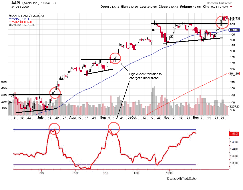
Chaos theory seems to be agreeing with what the leader groups are suggesting for the direction of the stock market. As I've posted on often, these groups have consistently been calling the next moves, and if you look at the QQQQ tech chart now, it is telling you which way is next. And if you look at the chief of the tribe, Apple, and apply a little chaos theory, you see this: (click to enlarge charts)

AAPL has broken the funk of the last couple months to the upside. The red chart below the price chart is the FDI (Fractal Dimension Index) which is a measure of energy buildup as a market cycles between periods of high and low chaos. Energy is expended as a strong linear trend transpires. A high FDI doesn't tell which direction the move is going to be, just how much energy has built up for it. (Apologies for not having the up to date FDI - I borrowed this read from Matt Trivisonno. I'm working on an FDI for my computer, need to work out some programming)

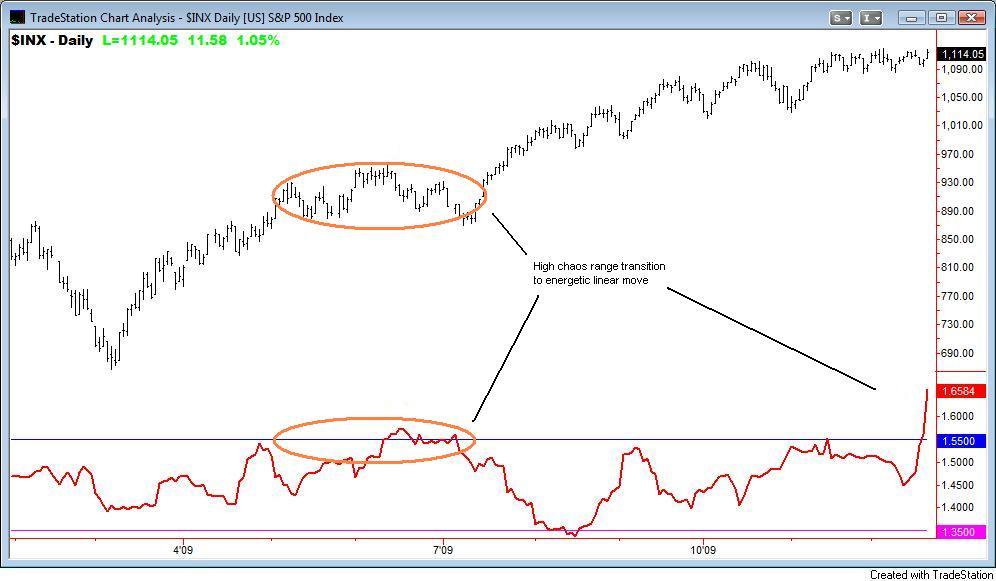
The direction of AAPL, this critical leader stock, is I think pretty clear, so what does chaos theory say about how energetic the following move in the broad market may be?

Wham bam o' lam! This is an extremely high reading for the FDI, but this is just a daily chart. But still it suggests at least a short term pop. This strangely enough agrees with what the Dow has been doing for the last year - closely following a fundamental recovery. You can debate the artificial stimulus sugar buzz approach, and what is real or not and how it will end. The chart below refers to the PPT (Plunge Protection Team). But the fact is a "V" recovery is proceeding and the market is shadowing it:


Here, perhaps the two things the stock market cares about the most, employment and housing, are superimposed on the Dow. Two things are immediately obvious. First, the market is doing a "V" that closely matches the economic figures. Second, the market is now sharply lagging the "V" suggesting an upside run. The above chart is from an article by Gary Dorsch over at Safehaven titled "Commodity Super Cycle" Ready to Rumble in 2010. He shows several other "V" s besides the set of figures shown above, and this all suggests a move up in stocks, which the magic of chaos has already figured out.