About a year ago, Jim Cramer was going all bonkers about the great smartphone tsunami headed our way, warning investors not to miss the giant wave. He was saying at the time that the mobile internet was going to be bigger to us than the chip was to the computer and what the internet was to the computer. Well, the smartphone revolution is proceeding. But is that making for an equal or better story in the related stocks? Cramer is pretty tech savvy and picking the good tech stocks was one of his strong points as a fund manager. So when he instituted his Smartphone Index on 8/12/09, I was interested. He picked out 20 names, and I puzzled over why he didn't include some. So I made up my "supplemental" smartphone index. Here's how they've done:
Cramer List of Top 20
TLAB + 3.7%
ADCT -10.3%
CIEN +18.2%
TKLC -13.9%
CTV - 5.3%
QCOM -22.9%
BRCM +34.0%
NETL +49.2%
XLNX +24.0%
SWKS +53.3%
RFMD -11.1%
ONNN - 7.3%
CY +0.7%
TSRA -28.4%
SNDK +185.5%
CSCO + 8.3%
GOOG +8.9%
RIMM -15.0%
PALM -57.8%
AAPL +61.8%
_____________
average= +13.8%
My Supplemental List
WRLS +15.2%
NTE -17.9%
ARMH +115.3%
CHA - 1.5%
SYNA +6.0%
CHU -10.6%
OVTI +73%
AKAM +137.5%
CREE +104.0%
ERTS -21.9%
STX +24.8%
LLTC +13.2%
____________
average= 27.5%
The Russell 2000 is up 16.8% over this same time and the QQQQ is up 18.7%, outclimbing the Cramer Index. I guess my +27.5% means I'm roughly twice as smart as Cramer. Now if I just had half his energy and charm.
My selections, given that I'm a tech idiot, were based more on cash flow history, valuation, and technical condition. This may infer that much of the smartphone technical particulars story may already be baked into the cake. It's hard to beat the market to the punch.
Sunday, June 20, 2010
Saturday, June 12, 2010
Gold's Support Level
Gold is, in some ways, behaving like it should if it were down at a major support level. GLD is in a distribution phase, the bullish percent index is at the low end of the range, and gold is on a back burner in the financial media's programming lineup. But gold is not in any big dip right now. In fact, it's right at it's all time high ! This would not be right if gold's proper bull market support level were the typical straight line. But, geometrically, it's entirely proper if the applicable support level is a curve:

The bull market since '01 is turning parabolic according to many gold bugs, and the recent support level behavior tends to support that thesis:

At each of the three major resistance levels over the last several years, gold finds itself near the all time high, but not exactly the hot item as resistance merges with a parabolic support level. We're right about at that juncture now as the parabola steepens.
Fractal analysis doesn't look at trendlines, just fractal dimensions, energy levels, and self-similar patterns. So it is a somewhat independent means of analysis. It's interesting that the fractal forecast last July called for a major surge to the upside (which happened) and is now calling for another such surge.
Thursday, June 3, 2010
What Is The Commodities Slump Telling Us ?
Commodities, if you haven't noticed, have broken down into a terrible slump, now far below the CRB's 140 day ema. This is rightly interpreted to signal a recession dead ahead most of the time. Add to this the pronounced slump in the ECRI's leading indicators, and you would have to say we're cycling into another recession. The ECRI slump was the subject of an article at SA on May 28 by Michael Shedlock. It shows an ominous 1 year dive in what usually precedes a recession.
But if you step back and look at a bigger view, you see another interpretation:
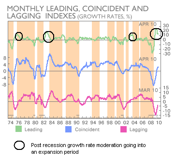
This multi-recession chart is also shown in the article (with the notes in black added) and shows a typical breaking of the "speed limit" coming out of a bad recession and then a moderation to a more steady speed going into the expansion cycle. The ominous 1 year dip would appear to be this moderation phase in the cycling.
You see something similar in the just released Journal of Commerce JOCSINDS indicator in the 1 year time frame. But if you click "chart the performance" for this recovery speed measure, and click on the 5 year view, you see pretty much the same moderation pattern as in the ECRI chart above.
So why are commodities looking so bad? A moderating, stable recovery should be just fine for them. Well, you may not have to look any further than the US dollar chart to explain this. Commodities and the dollar are strongly correlated inversely. There has been something of an aberrant, monster rally in the USD in the face of the European debt turmoil. It's aberrant because the USD has all the same problems as the euro. What happens when the dollar rally fizzles? For now, the rally has correlated to a big dent in what would be a normal, strong recovery in commodities: (click on charts to enlarge)

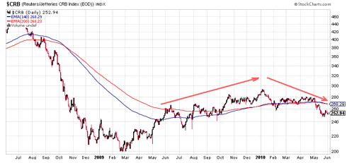
Since the turn point at the start of the year, we've had a 17% rally in the USD and a 12% drop in the CRB. The two are not unrelated. Gold usually moves with commodities inverse to the dollar, but gold is climbing. And gold is coming to be viewed as an alternative currency. What's happening with commodities is mostly a currency thing, not an economic cycle thing. China's Shanghai index is in much the same predicament as the CRB. It has, to a large extent, been caught up in the slump of the euro because Europe is China's biggest export customer.
The currency thing is, of course, a debt thing; and that's a downer. So if you attach any predictive significance to current commodity performance, you would have to say it's forecasting debt domino problems, not problems from the normal economic cycles. The leading market groups such as the RLX, the Baltic Dry Shipping Index, the QQQQ, etc. all still seem to be positive. But the debt can they have successfully kicked down the road is another story and will continue to be a threat to derail all normal economic cycling until they pick up the can and fix it.
But if you step back and look at a bigger view, you see another interpretation:
This multi-recession chart is also shown in the article (with the notes in black added) and shows a typical breaking of the "speed limit" coming out of a bad recession and then a moderation to a more steady speed going into the expansion cycle. The ominous 1 year dip would appear to be this moderation phase in the cycling.
You see something similar in the just released Journal of Commerce JOCSINDS indicator in the 1 year time frame. But if you click "chart the performance" for this recovery speed measure, and click on the 5 year view, you see pretty much the same moderation pattern as in the ECRI chart above.
So why are commodities looking so bad? A moderating, stable recovery should be just fine for them. Well, you may not have to look any further than the US dollar chart to explain this. Commodities and the dollar are strongly correlated inversely. There has been something of an aberrant, monster rally in the USD in the face of the European debt turmoil. It's aberrant because the USD has all the same problems as the euro. What happens when the dollar rally fizzles? For now, the rally has correlated to a big dent in what would be a normal, strong recovery in commodities: (click on charts to enlarge)
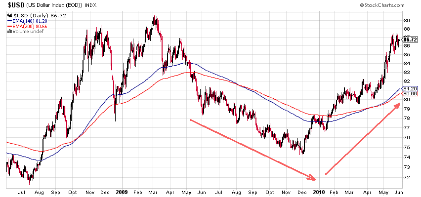

Since the turn point at the start of the year, we've had a 17% rally in the USD and a 12% drop in the CRB. The two are not unrelated. Gold usually moves with commodities inverse to the dollar, but gold is climbing. And gold is coming to be viewed as an alternative currency. What's happening with commodities is mostly a currency thing, not an economic cycle thing. China's Shanghai index is in much the same predicament as the CRB. It has, to a large extent, been caught up in the slump of the euro because Europe is China's biggest export customer.
The currency thing is, of course, a debt thing; and that's a downer. So if you attach any predictive significance to current commodity performance, you would have to say it's forecasting debt domino problems, not problems from the normal economic cycles. The leading market groups such as the RLX, the Baltic Dry Shipping Index, the QQQQ, etc. all still seem to be positive. But the debt can they have successfully kicked down the road is another story and will continue to be a threat to derail all normal economic cycling until they pick up the can and fix it.
Subscribe to:
Posts (Atom)