Thursday, July 30, 2009

The Bridge Is Out

Richard Kinder of Kinder Morgan Energy (KMP) was on today's Mad Money show pointing out some important things on our energy policy (or lack thereof) concerning natural gas. Of course you could say he's just talking his book, being head of a natural gas company, but what he and Cramer stressed is critical stuff for all of us. Kinder wrote a piece in the Houston Chronicle this month showing how dangerous it is to form energy policy around nothing but renewables, which seems to be what the administration is bent on, ignoring the fact that they currently make up only 1/6th of 1% of our energy supply. The scale up of these fuels is going to take many years and we must have major bridge fuels already scaled up to get us from oil to sun and wind. But the approach of the village idiot of global energy policy (the U.S.A.) is to punish all workable bridge fuels and promote only the pollutant free energy. All other nations are not this stupid, and America could pay a heavy price in lost power as the oil age rapidy closes over the next 10 to 15 years as this chart shows (click to enlarge)


The blue curve topping out around 2030 shows the world's energy supply from natural gas production, natural gas plus natural gas liquids, which currently gets counted as "oil". See how the gas contribution compares to that of oil, the yellow line? And these curves don't even show the massive new recoverable shale gas in North America, a game changer. The difference between the pricing of oil and natural gas is going to get ridiculous. We desperately need natural gas as the main bridge fuel to get us safely from the dangerous oil mess we're in here in America to the nonfossil future. But Congress is doing all they can to blow up the bridge.

The energy crisis we face is all about timing and EROEI. The energy sources are all there - solar, wind, future ethanols that will work, and our remaining fossil allotment. The problem is that most of the nonfossil alternatives will never have the EROEI to effectively replace high EROEI oil and supply the world's energy and will take many years to scale up to what is needed for oil replacement. The other stuff that will have the needed EROEI will take too long - we will face the net energy cliff edge before they are scaled up to what is needed (see my June 19 blog post "The A
lternative Energy No One Is Thinking About").

That leaves natural gas as the only here and now critical bridge fuel to get us from the cliff's edge to the other side where we will have high EROEI non fossil fuels scaled up and economical.

But even if you did not even consider all the net energy situation (which no one is considering anyway) NG, in addition to being the most energy dense and highest EROEI energy source, is also the quickest and cheapest way to cut all forms of pollution! Compare these pollution rates for the three fossil fuels NG, Oil, and coal:

Pollutant NG Oil Coal:

CO2 117,000 164,000 208,000
Carbon Monoxide 40 33 208
Nitrogen Oxides 92 448 457
Sulfur Dioxide 1 1122 2591
Particulates 7 84 2744
Mercury 0 0.007 0.016

Source: EIA - Natural Gas Issues and Trends, 1998

And also from the DOE, they estimate that 50 % of all air pollution comes from our cars and trucks (80% in cities). They say that an immediate switch to NG powered vehicles would:

cut CO2 by 25%
cut NOx by 35% - 60%
cut carbon monoxide by 90% - 97%
cut other nonmethane hydrocarbon emissions by 50%-75%

And we have the technology already developed to do this! You can switch your vehicle over with a trip to the mechanic and about a $1500 bill. They commonly do this in many other nations. Considering that NG engines run so much cleaner that the oil stays pure and engines last 2 and 3 times as long, that switchover bill pays for itself, not to mention that domestic nat gas is less expensive per mile even during times of geopolitical peace.

What other government programs looking at putting windmills on cars soaking up billions of our tax payer dollars would immediately cut pollution by the percentages above? None.

But they ignore the Pickens Plan and would rather fill the air with unnecessary pollution from our current dangerous imported oil as we drive to the edge of the net energy cliff.

Monday, July 27, 2009

LABL at a Strong Technical Juncture

Multi-Color Corporation (LABL) is what I call a "clothespin stock". They are a dull, boring little company that makes non-trendy stuff we use but don't get too excited about (like clothespins). If these companies execute well and their stock gets whacked in a market event, it can present a nice undervalued buy that is not very sensitive to chaotic market ups and downs and product cycle changes. Sounds nice in this kind of market. LABL is such a stock. They make labels of all kinds for office and home use, which you'd think would be suffering in this recession. Well, since the start of '07, their gross profit (ttm) is up 50%, operating income is up 28%, cash flow from operations is up 37%, and even net income is up 18%. Sounds like the numbers you hope to see from a kick-ass growth stock in good times. You currently get the stock at a price/sales of 0.6 and price/cash flow of 6.6 vs 1.9 and 18.9 industry group averages. Technically, you have this:
(click to enlarge chart)


Despite the good numbers, the stock has been smacked from 28 to about 12. But as the chart shows, there seems to be a clear case of seller exhaustion with this one. It was dead as a hammer over the intense February selling. Also it has been ignored by new buyers so far in the rally - a nice combination.

Saturday, July 25, 2009

Margin Debt Catharsis?

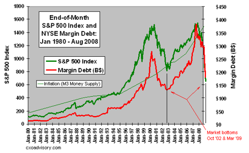
The level of margin debt used by investors at the major exchanges has always been closely correlated with market tops and bottoms. It gets to high levels at market tops and vice-versa. There is usually a clear, snappy, climactic turn at a major market bottom. (click to enlarge charts)

This is a chart from CXO Advisory I have modified to show the March 9 bottom event and also the relation of inflation as measured by the M3 money supply to all this, which is quite important really. The chart obviously shows we are now way out of whack with our stock market relative to the money supply curve.

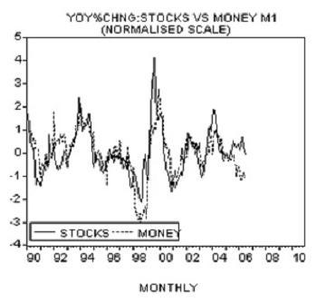
If a chartist arrived here from Mars, not knowing anything about the financial pickle we've been in, he would surmise that this M3 thing seems to push everything else around. The stock market follows M3 and the margin debt follows the stock market. The Martian would not be the only one with that opinion. Dr. Frank Shostak, Professor of Economics, wrote a small treatise on the relation between money supply and the stock market where he begins by asking "Is it true that changes in stock prices are predominantly set by changes in money supply?" Here, he discusses alternate points of view and concludes, "Observe that what drives the entire story however is the original loose monetary policy of the central bank - the creation of money out of "thin air". The causality therefore is from money to stock prices and not the other way around. The whole story is reversed when the pace of monetary pumping by central banks slows down." And the correlation is pretty good as he shows in this chart of money supply in the South East Asian stock markets:

Perhaps we should just look to money supply as the target for the S&P 500 whether that's right or wrong policy. In all this chaos, Helicopter Ben and the powers that be seem bent on fixing everything with the magic wand they can control until a currency crisis eventually stops them.

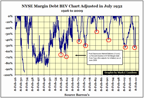
So are we making a sharp turn in the Dow back up to chase down the money supply as shown in the first chart? Well, we seem to be making a snappy turn when you look at this margin debt chart:

This "BEV" chart by Mark Lundeen zeroes all the tops of the margin debt climb to adjust for inflation and just shows the percent declines in the moves down. The bottoms of virtually all the post Depression selloffs are marked by sharp turns in the margin debt declines. When viewed in this context, our current end of the world looks more like a garden variety snap turn back up to chase down the money supply curve. But in the present case, we are more out of whack with money supply than usual, and the turn is snappier than normal - the snappiest since 1965. The margin debt level is quickly back up to worrisome levels, but when viewed in the money supply context of the first chart above, it may just be getting started in the next leg up.

Friday, July 24, 2009

Dow Theory Confirmation of Breakout?

Since early June, the market's move off the bottom has been idling at a red light at a hazardous intersection (see my June 12 blog post). There are several things that make this stalling action a no man's land turning point between bull and bear, one of which has been lack of good confirmation of technical progress by the transports. Charles Dow authored a series of letters around 1900 that posited what has become known as Dow Theory. It became known and practiced because it works really well. It predicted the start of a bear market in late 2007 and now is at an interesting juncture. The basic confirmation principle says that any meaningful chart progress down or up by the market at large must be duplicated by the transportation stocks or it is suspect. If you have the S&P 500 going one way from a significant technical juncture and the transports going the other way, the theory suggests that the broad market will change direction.

Right now, the transports are having a tough time getting their ducks in a row. There are several transport indexes with some lagging the S&P badly and others lagging very badly. However, in the last week or so, some indexes have come alive and confirmed the S&P's breakage of key technical barriers while others still look very weak and nonconfirming. What is the source of the discord? It's the railroads.

About a year ago, the investment community was abuzz about Warren Buffett aggressively buying the railroads. What's up with the rails? Well, that's a subject for another post, but one key thing is the end of cheap oil. In North America, we are embarking on projects like the replacement of foreign oil with coal, tar sands, ethanol, and other fuels that are mined, scraped, crushed, grown, and hauled in lieu of simply piped. The escalating price of oil also places some aces in the hands of the rails because they can transport tonnage using less than 1/4th the fuel used by splitting the load up onto trucks and placing them in stop and go traffic. As fuel cost, not to mention conservation efforts, become a sore point, a rising oil price induces a lot of leverage in the transport biz in favor of the rails. And one thing Buffett likes about these companies is that their business has very high barriers to entry. It's very hard to start up a big rail line.

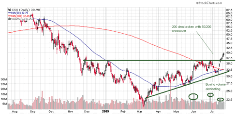
The railroad stocks began climbing in the wake of Buffett's buying, then were crushed with the market. But just over the last week or so, they have come back to life like CSX: (click to enlarge charts)

This explains the wide difference in the transport indexes:

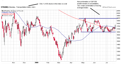
Here we see the Nasdaq Transportation Index seeming to shy away from confirming the S&P's breaking of the 200 dma, the 50/200 cross, and the turn north out of the consolidation of the last 2 to 3 months. This index is made up of 65 companies with only 1 rail. What happens if you put a bunch more rails in?

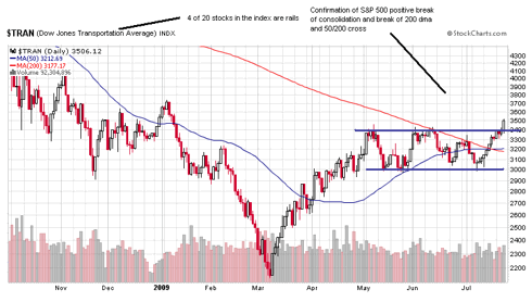
So much better! This is the Dow Jones Transportation Index composed of 20 companies with 4 major rails - 20% of the index. Until 2 weeks ago, even this version of the transports was not confirming the good technical work of the S&P 500 having stayed below the 200 dma with the whole consolidation pattern well below the January high for the year. But with the help of the railroad breakout, that is changing.

Which version of the transports should we go by? Charles Dow might say the rails of course. That was about the only industrial transportation in his day.

Tuesday, July 21, 2009

Buffett's Railroads Revisited

Last year about this time, one of the big buzzes in the investment community was Warren Buffett's aggressive buying of the railroad stocks. Everyone was scratching their heads over this until they began seeing some neat things about the old stoggy rails.

For one thing, perhaps the biggest thing, the escalating price of oil puts some aces in the hands of the rails. Trains can move tonnage using only about 1/4 th the fuel it takes to split the load up on trucks and put them in stop and go traffic. The end of cheap oil has also placed more of a premium on coal, and the rails move the vast majority of coal. Also, ethanol can not be shipped in our conventional pipeline system, so the aggressive mandated ethanol production growth curve works in favor of rail tanker cars. As we must dig, scrape, grow, and haul our oil instead of piping it, the rails will expand into the role of energy supply.

One of the things Buffett likes about the rails is the high barrier to entry into this business. It's hard to start up a big rail line. As more want in, the few established lines can ride the gravy train all by themselves. No dilution of the profits among a flood of upstarts as with a hot new tech toy.

Well, that was last year. The rail stocks started to climb, then were demolished along with all investments. But the facts haven't changed. So the rail stocks are now a very good way to participate in a recovery. Right now they are doing some nice breakout moves like CSX:


Friday, July 17, 2009

Fractal Early Warning System?

The earnings season has gotten off to good start with a very positive market response, even though many point out that bars have been lowered so much, the market's reaction may not be meaningful. I've never looked to earnings reports as guages for a stock's movement. As you see over and over, the market will go up in spite of bad news or go down on good news (buy rumors, sell news). Why is that? The market is a discounting mechanism and digests far more news than you or anyone can be paying any attention to at any one time. The market has a way of moving to the tune of other, more mysterious things. This is why technical analysis is so important. It reads the full digest of all the news plus all the mysterious stuff.

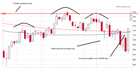
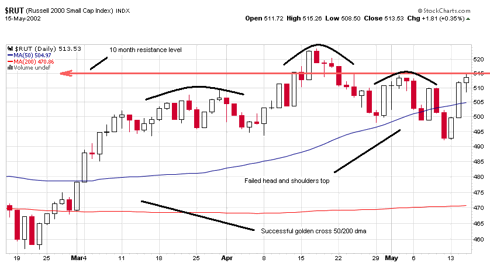
Right now, the earnings reports and the charts are putting investors in a much better mood. They are celebrating a defeated head and shoulders top formation that had so many so worried. And the glorious golden cross has received much attention too. Altogether, things have improved like so: (click to enlarge charts)

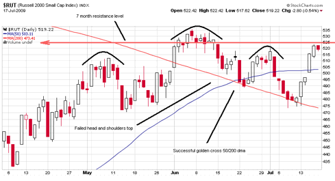
We appear ready to blast through the long resistance level going back to the beginning of the year. Does the above chart look familiar? In case it doesn't, I'll show you the current chart of our market:

It is a repeat of all the major components in the previous chart, which is for the same Russell 2000 at the end of the major bear market rally that ran to mid 2008. The very next trading session began the market's huge collapse. The two charts are very similar in a kind of fractal way. The failed head and shoulders is more pronounced in the S&P 500 chart. This sharp up move at the very end of bear market rallies is a usual pattern as was mentioned by Peter Cooper in his July 16 article at Seeking Alpha. Did it occur at the end of the big rally going into mid 2002 before the big drop then?

Pretty much. There were a few subtle differences. It was a 10 month resistance level instead of 7 months. And the golden cross was back in January and the market had been above the crossed 50 for months. And the upsnap at the very end was a little more muted. But the major components were there.

But the macro-economic conditions are much better than these other cases you may argue. The recession is about to end for Pete's sake. Well, may I remind you that when the steep plunge in late 2002 transpired, the most powerful of the entire bear market, the recession had been officially over with for nearly a year!

Am I saying sell everything Monday morning? Well, no. But if the market doesn't break the resistance and comes back below the 140 dma, I'm going to get even more defensive than I've been since early June.

Wednesday, July 15, 2009

More Confusion

In case you're not confused enough on the market's direction, let me toss this at you. Lowry Research, mentioned in my previous post as predicting a breakdown below the March low, is a very respected company with a good long-term record of getting it right. They've been independently checked on their calls from 1950 to 1975 according to their home page, with an overall market gain of 2 1/2 times the market's performance. Paul Desmond, the president, is the 2009 Technical Analyst Magazine Technical Analyst of the Year. Their proprietary buying power vs selling pressure method apparently works well. But if you take just the buying power half of that tabulation, it correlates to historical lows like this:


Buying power is at the low point of March 9 this year, which is the lowest since September '42. What happened after September '42? The market went right into about a 30% climb over the next 8 months, about like it did at the March 9 low point - both historically fast climbs. The lowest buying power ever was a smidge below this level in February '33. What happened in February '33?


Just one of the most powerful bull runs in history from February '33 to early '37. Lowry's methods compare the buying power against selling pressure to predict the market, and when they do that they get the widest span between the two numbers ever calculated for the current market - indicating a severe downturn. but obviously if you take just the buying power number by itself, it seems to be saying buckle your seat belt, we're igniting into a severe climb.

Are we confused yet? It should be noted, however, that the buy signal interpretation of Lowry's buying power ignores the fact that new bull markets from historic buying power lows always run for years before a next historic low - our present market has put in a buying power low March 9 around 96 then soared in the rally before falling back to this low just 4 months later. Per Paul Montgomery, who updates Dennis Gartman's newsletter on Lowry data, "According to Lowry's, since their data base began some 76 years ago, no new bull market has ever given up all its initial gains in Buying Power, which the current market has done." They see the March 9 low as a stop on the way to the real bottom. If this really was a bear ending rally, the buying power would keep building instead of quickly evaporating.

At least all these signs I've chronicled agree with my basic technical analysis that I detailed in my June 12 Seeking Alpha post- we are at a red light in a big, dangerous intersection waiting to turn. But which way? I tend to favor the basic leadership pattern mentioned in my previous post. It is still intact and functioning and indicates a north turn. But even this sign has a fly in its ointment. The transports are also a critical leadership group, or at least a confirmation group according to Dow theory, and if you look at this chart, you see that the transports are not participating in the recent strength and are a long way from confirming any positive development in the broad market.

Tuesday, July 14, 2009

More Bear Signals

I've been pointing out some danger signs for the market since mid-June and feeling a little lonely amid all the green shoots and end of recession signs. But I find I'm not the only one reading danger in the stock market. I've pointed to:

1. The 140 EMA being a big bear/bull barrier normally broken energetically after the bear is over, which is not being done now

2. The RSI of the % stocks above the 50 dma chart signaling big declines when the market is trading below the 140.

3. The post recession/debt trend suggesting our present debt load may cause stock market problems well after the end of the recession.

Add these signs:

4. VectorVest has been calling the major turns of the market with amazing consistency, and, after issuing a market up signal on March 26, just changed that to a market down on July 10. They don't issue confirmed market direction changes very often, but when they do, they are usually right.

5. The Yen, which nearly always moves inversely to the stock market's major moves, is doing a base break-out move to the upside. Check FXY

6. Lowry Research is known for finding that 90-90 days (days when a move is with 90% or more of the volume on that side of the trade) accurately announce major market directions. We've had some of those lately on down days, but they rely heavily on their proprietary demand/supply modeling of trading, and they say the recent rally is without strong hands and not indicative of a bear ending move. A CNBC interview on their bull/bear view with their president by Bob Pasani suggests more bear market.

So the market is going to have to bowl over a bunch of reliable signals to make its next major move up, which it may well do. My view is that the market is at a major turn point, and hasn't made its direction out of the intersection known yet. There are good arguments for the consolidation to break to the upside, not the least of which is the leadership issue. The groups that have been leading the broad market both down and up since mid '07, consumer discretionary and tech, are technically much healthier than the S&P. The buy volume is bullish, and these two groups look to be successfully testing the crossed 140 as support in the consolidation. As long as this follow-the-leader pattern stays intact, you'd have to favor a north turn out of the broad market's funk. Its a tug-of-war. But the driver seems to have the front wheels turned south. We shall see.

Monday, July 13, 2009

Rare Signal Speaking

Should we listen? I am referring to the % of all NYSE stocks trading above their 50 dma. Not this chart itself but the RSI (Relative Strength Indicator) for the movement in this chart. Since the start of 2002, when StockCharts began charting it, this RSI parking itself below 30 with the market trading mostly below its 140 day EMA (bear periods) has occurred only 3 times. Each time produced the same result in the market afterward. Lets look at these 3 episodes: (click to enlarge and read charts)


Here, the RSI significantly broke below the critical 30 level about a month before the intense late 2002 selloff while the market was still in a fairly mild decline. The next episode:


This was in front (just barely) of the strong August 2007 selloff. This was right at the start of our present bear market before it got very bad. The lead groups were rolling over and were just starting to trade mostly below the 140. The third episode:


This was very similar to the mid 2002 episode with the sub 30 dip occurring a month in front of the main drop. Oh, and there is a fourth episode of this warning signal:


Yes, it's happening now. This rare signal is speaking again. What is it saying? Get out of Dodge.

Saturday, July 11, 2009

Market Update

The following is a post I put up on June 12 "Market at Red Light in a Big Intersection":

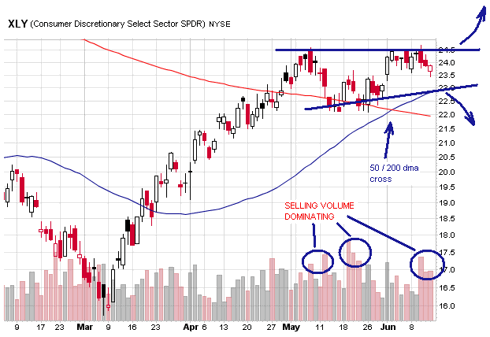
The rally is at a critical turn point having just made it through the 100 dma a month or so ago and now struggling to break and hold the 200. This wouldn't be such a sticky wicket if the leader groups the broad market has been following were not at turn points themselves. These groups, like retail and consumer discretionary, have already successfully forged through the 200 dma and accomplished a 50/200 dma crossover (the S&P 500 has not), but now these generals are at this juncture: (click to enlarge charts)

The RLX Retail Index is in pretty much the same condition. This triangle consolidation typically breaks sharply one way or the other. A break to the downside out of the formation is also a break of the 50 dma and would likely pull the S&P 500 back from its attempt to take up residence back above the 200 dma and force some more bear shenanigans. The volume pattern is perhaps more disturbing than the formation with a very clear bias to selling.

Over at safehaven.com/sh... Marty Chenard has an article and chart showing a RSI indicator that stalled at the top of each rally during the 2000-2003 market and was breached only when the 2003 bull began. Where are we now on the chart? Right at the same level as the rally tops in the previous bear. So we are at a turn point by this indicator as well.

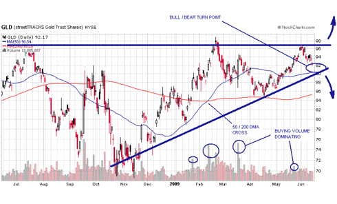
Gold is also at a technical intersection:

The GLD is approaching a bull/bear turn point at around 90. Like the XLY, a break of the formation to the downside is also a break of the 50 dma. If you go strictly by the big volume days indication, you would expect the stock market to turn down and gold to turn up, acting like they're supposed to (inversely correlated). But not so fast. There are many cases of both gold and the stock market making big moves together. You need to look no further than the last bear-to-bull transition of 2001-2004 to see an example of this.

I suspect that, after the big run from the low, the indexes are just doing a natural consolidation before continuing the bull move. But putting a lot of new money to work right now is a little dangerous. I raised some cash this week and will refrain from redeploying until I see how these turns play out.

Update: The formations on the RLX and XLY have since broken to the downside, the S&P has formed a head and shoulders top formation which has proceeded to break to the downside slipping back below the 140 EMA in the process. See the post "End Of Recession..." to see why we should be paying attention to the 140. Selling volume is dominating, accumulation/distribution is breaking down. In short, a lot of really bad stuff has happened. Add a siren to the red light.

Gold has weakened also, but GLD is holding right at the 90 area I'm drawing as a support level. And the gold stocks seem to want to hold their support levels for now.

Stock Selections

A primary purpose of my blog will be to present posts on individual stocks. Sector and overall market thoughts I love to research and write about, but I'm mainly a bottom up stock picker. I am trying to become a better market direction analyst, because, as Cramer often says, half a stock's movement is usually just its sector movement.

What I'll be presenting is for "informational use" only as the paranoid legalese disclaimers stress (Do read the Terms of Use Agreement on this site if you can stay awake to the end). I am not acting as anyone's financial advisor with this web site, because the role an advisor fills is to manage risk level between investments and an individual. You could be in a heap of trouble if you rely on me for that!

Use my stock posts as contributions to the research you and/or your advisor does. Sometimes, like right now, I will deem the market to be at a dangerous juncture and will present no stock selections. And I am going to monitor the stocks I present and post my best determination of when to sell them. I've been defensive on the market since early June. To explain why, I'm posting a copy of my Seeking Alpha post from June 12 "Market at Red Light..".

Thursday, July 9, 2009

Why End Of Recession May Not Be Good For The Stock Market

The Green Shoots advocates see the recession ending and the stock rally as confirmation. But when you look at the history of our recessions compared to our present condition - well, let's just take a look.

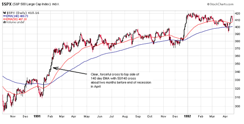
What most analysts miss is the debt dimension to our present mess. You can present all kinds of charts on the usual indicators of the recession/recovery cycle as is done in this eye opening article " target="_blank">www.huffingtonpost.com/hale-stewart/the-... showing the end of recession is near, but that may be no sign that the bear market is over! The two events used to be about one and the same. But if you look at our last recession cycle on the charts in the Huffington Post article and study 2001, you see that the indicators had all bottomed, the recession ended, and the really damaging stock market declines were still about a year into the future. This crash was largely debt related. If you go back to the recessions that occurred before we began building our mountain of debt in the mid '80s, you see a different market behavior. For example: (click to enlarge)

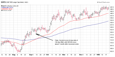
The 140 day exponential moving average is good about separating the significant bull and bear moves if you wait at least a couple months to see if the market stays crossed. This is especially true when accompanied by the cross with the 50. In the '82 recession, you had a clear and immediate 140 cross right at recession's end. Same thing with the '90 recession:

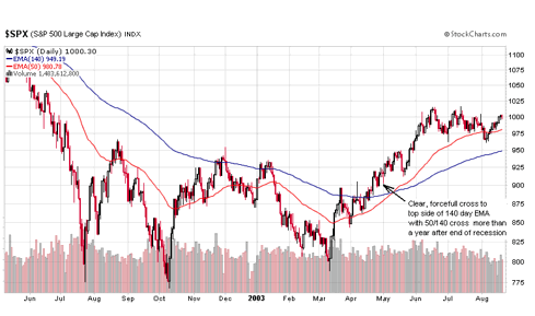
In the '01 recession, the clear stock market bull cross of '03 didn't happen untill well after recession's end in '01 and a horrendous stock crash much later in '02:

Why the big delayed reaction for the stock decline? Could it be that in '82, there was no mountain of debt to complicate things? And the mountain hadn't been built very high yet in the '90 event. It started to be more of a problem in the '01 event. But in 2009, we may be facing another debt induced stock aftermath similar to the post 2001 recession period, when the mountain of debt was a mole hill compared to now.

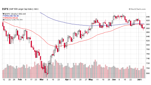
As for our '09 rally confirming the end to the recession and an immediate new bull, the charts don't indicate that. The recession may well be ending, a lot of purely economic indicators including the Baltic Dry Index on the global scale agree, but if you look to see if a multi-year bull market is back like after the above recessions, this is what you see:

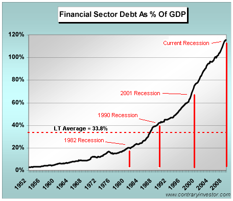
Instead of the clear, forcefull crosses to the top side of the 140 after the previous recessons, you see a pathetic attempt that appears to be failing. Given the monstrous debt dimension of our present recession, a failure to break the 140 at this stage could be a very bad sign. If we are to continue the trend of mounting debt level inducing instability and trouble for the stock market in the wake of a recession, we should expect more bear market after our recession ends as this debt/recession chart suggests:

Note that the 1982 and 1990 recessions occurred very near the long-term average debt level of 33.8%, and the ends of these recessions were good for the stock market. By the time the 2001 recession came, we had strayed away from this somewhat stable level and the end of this recession did not end the market's trouble. And now, we are far, far away from this level.

Sunday, July 5, 2009

Is Gold at a Fractal Moment?

If you've never heard of fractal market analysis, prepare to be weirded out. This emerging science attempts to predict the movements of stocks and commodities by looking at - well, I'm not sure what it looks at. Nobody is sure. Even Benoit Mandelbrot, the French mathematician who founded fractal geometry, offers no definition of just what a fractal is. So I'll offer mine. It is a repeating pattern of movement found in nature with each thing having its own patterns occurring the same in all time frames. Fractal science is about as obtuse as anything ever gets. When I first read a David Nichols explanation of fractals, my impression was, "What is this dude smoking?". But the more I think about it, the more sense it makes to me. I fear for my sanity.

This science has been used to study snowflakes and such, but it has only been during the last 10 or 12 years that they have focused it on the financial markets. Some things are fractal and some aren't, and they are sure now that stocks and especially gold are fractal. According to Nichols, a leader in this endeavor and publisher of The Fractal Gold Report, this emerging genre' of technical analysis is being tried out in fund management but very little is being published on it - for now. But he claims it will be a perfected and common analysis tool in the future. What is clear at this point is that fractal analysis tends to produce major turn point predictions with mind boggling accuracy. Imagine a method that tells you gold will top a major climb at say $1010, then do a major decline to a $550 bottom, and have gold do exactly that within about 5% of those prices. That's the kind of thing fractals are doing.

There have been scholarly works published such as Fractal Market Analysis by Edgar Peters in 1994 and there are software products available that calculate some fractal components. But it apparently takes a trained human eye at this point to really capture what fractals may be capable of. Nichols calculates a "fractal dimension" measure of energy where you can gauge the beginning and end of a major trend. When a high explosive trend is about to be unleashed, it has the fractal dimension go above 55. As the trend is exhausted, the fractal dimension goes below 30.

Enough fractal theory. How does this cockamamie stuff work in the real world? Well, I've cobbled together many of the predictions David Nichols has made in various past articles on gold as per the chart below (click to enlarge and read) , and their accuracy is unreal. He makes some errant calls, but most are downright unbelievable:


Some of the shorter term correction targets were off, but the turns have been mostly called to a tee. The 9/23/08 call for a decline to a "likely 850" seems strange in light of the repeated previous predictions for the major downtrend to reverse at the 680 to 730 area, which is exactly what happened. On 1/24/08, the Fractal Report predicted a major multi-month top coming near 3/22/08 at 1010, then the following major decline going to 730. What happened? Gold went to an intraday high of 1030 then set a closing high of 1004 on 3/18/08. Then the decline went to the 730 level shown above. All this called months in advance.

Nichols is human. In a Seeking Alpha article of 4/17/08, he made the boneheaded prediction that the recession would be short and shallow and the S&P 500 was going higher. But his macro economic call was based on some charts other than fractals. The fractal chart then did show a fractal dimension of 55 and the market did sprint from 1352 up to 1440 in just a month. But then the big debacle.

The fractal forecast for gold more recently is presented by comparing the two major consolidation periods in gold's bull market thus far: (click to enlarge)


Fractals are all about repeating movement patterns. So Nichols has labeled the week of each of the major turns in this first consolidation period in '06/'07 to see if they are showing up now:


Sure enough, there they are. The course of this second consolidation has gold going into the next hypergrowth phase in July if the week count of the two consolidation periods is obeyed with the up move beginning around week 70. The technical condition of gold right now is also bullish with it sitting on a recently crossed 100/200 dma support level with both moving averages sloping up - very bullish. But Nichols cautions not to make too much of these shorter term "templates" as they don't alter the longer term trends, which for gold, he says, is a run up much like the latter half of the Nasdaq climb of the 90s.

Wednesday, July 1, 2009

ARM Holdings A Buy?

The evolution of all connectivity gadgets to the smartphone is one of those megatrends all investors would like to ride in some way. This trend is cleverly depicted at the everylaptopleftbehind.com blog. The header shows an ape-to-man graph with the earliest form of life sitting on a chair punching a big computer which is sitting on a desk. Then the intermediate stage has him stooped over cradling a laptop around with both hands. The final stage has him sauntering freely with a barely noticable smartphone in one hand.

The smartphone is a trend that, according to many experts including Jim Cramer, is being underestimated and presents a prime investment area. Since the first one, the Simon, was introduced in 1992, technological improvement has advanced to the point where the smartphone has now become a "gadget killer". Wired Magazine ran an article on 11/17/08 called Five Gadgets That Were Killed by the Cellphone where they list the PDA, the low end pocket camera, the UMPC, the stand-alone phone, and the MP3 player as a few of the smartphone's victims with the laptop next on the hit list.

Some of the higher profile companies with heavy involvment in smartphones are:

ADCT ADC Telecommunications MRVL Marvell
ADI Analog Devices BRCM Broadcom
SWKS Skyworks Solutions PALM Palm
AAPL Apple QCOM QUALCOMM
RIMM Research In Motion STAR Starent Networks
RFMD RF Micro Devices

What else do these stocks have in common? All of them have out performed the S&P 500 since the broad market rally went flat in late April! Some by a little, most by a lot.

ARM Holdings (ARMH) is a somewhat lower profile, less loved name that nonetheless has a pivotal role in the smartphone revolution. They are a UK based company that licenses chip architecture. Their processors compete with Intel's Atom design for smartphones.

According to Robert Castellano in a 3/10/09 Seeking Alpha article, "ARM processors, not Intel's Atom, will benefit from the current technology-economic cycle. Anyone thinking that ARM will make up only a small percentage of netbooks going forward is not thinking outside the box." Netbooks are sort of between a big clunky, expensive laptop and a smartphone, only you can't talk on it - probably another gadget to be severely wounded if not killed by the smartphones. Castellano explains that the sluggish economy, price point for mobile internet access, and ARM's basic architecture all conspire to change the competitive landscape:

" ... ARM runs under the Linux operating system. Linux is free, whereas Microsoft charges a licensing fee up to $35 on each netbook. To furthur keep costs down near the intended $100 price point, enter cloud computing. Cloud computing is a web-based service that resides on the web, and is much cheaper than software packages that are purchased and stored..."

ARM processors are common in the smartphone market and, with the next generation Cortex-A8 and A9, may replace Intel's current Atom domination of all the other MID (Mobile Internet Device) products like netbooks. Castellano predicts a 55% market share by 2012.

ARMH stock has been battered, down to $5 from $9, but if you look at the last 10 years of their financial results, you see no recession. In fact, cash flow from operations, revenue, and eps have all grown nicely over the course of the debacle. But the valuations of price/sales 5.2, price/cashflow 15.4, and PE 35 repulse me. Still, Morningstar lists these numbers as much cheaper than their industry averages. And historically, the stock has always traded at these valuation levels - no frenzied bubble problem.

Two of the megatrends in technology are likely going to be a smartphone revolution and cloud computing. ARMH has their hands in both pies.