
The level of margin debt used by investors at the major exchanges has always been closely correlated with market tops and bottoms. It gets to high levels at market tops and vice-versa. There is usually a clear, snappy, climactic turn at a major market bottom. (click to enlarge charts)

This is a chart from CXO Advisory I have modified to show the March 9 bottom event and also the relation of inflation as measured by the M3 money supply to all this, which is quite important really. The chart obviously shows we are now way out of whack with our stock market relative to the money supply curve.
If a chartist arrived here from Mars, not knowing anything about the financial pickle we've been in, he would surmise that this M3 thing seems to push everything else around. The stock market follows M3 and the margin debt follows the stock market. The Martian would not be the only one with that opinion. Dr. Frank Shostak, Professor of Economics, wrote a small treatise on the relation between money supply and the stock market where he begins by asking "Is it true that changes in stock prices are predominantly set by changes in money supply?" Here, he discusses alternate points of view and concludes, "Observe that what drives the entire story however is the original loose monetary policy of the central bank - the creation of money out of "thin air". The causality therefore is from money to stock prices and not the other way around. The whole story is reversed when the pace of monetary pumping by central banks slows down." And the correlation is pretty good as he shows in this chart of money supply in the South East Asian stock markets:
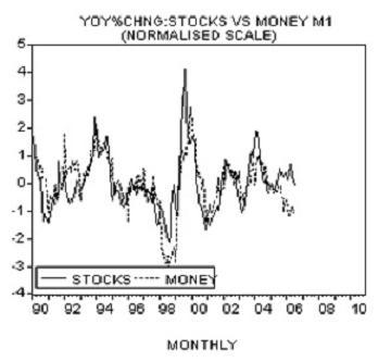
Perhaps we should just look to money supply as the target for the S&P 500 whether that's right or wrong policy. In all this chaos, Helicopter Ben and the powers that be seem bent on fixing everything with the magic wand they can control until a currency crisis eventually stops them.
So are we making a sharp turn in the Dow back up to chase down the money supply as shown in the first chart? Well, we seem to be making a snappy turn when you look at this margin debt chart:
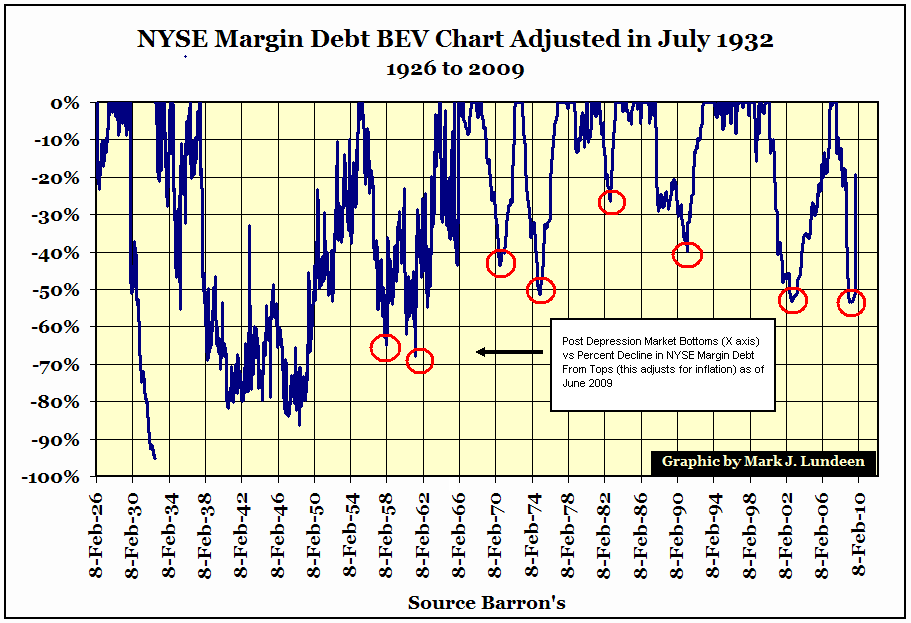
This "BEV" chart by Mark Lundeen zeroes all the tops of the margin debt climb to adjust for inflation and just shows the percent declines in the moves down. The bottoms of virtually all the post Depression selloffs are marked by sharp turns in the margin debt declines. When viewed in this context, our current end of the world looks more like a garden variety snap turn back up to chase down the money supply curve. But in the present case, we are more out of whack with money supply than usual, and the turn is snappier than normal - the snappiest since 1965. The margin debt level is quickly back up to worrisome levels, but when viewed in the money supply context of the first chart above, it may just be getting started in the next leg up.


No comments:
Post a Comment