If you follow the new science of fractal analysis, you may be aware of the 64 month bull market fractal that I wrote an article on awhile back. David Nichols and others have been developing this method for years, and Nichols has identified this 5 1/3 year (64 month) parabolic growth pattern as being very prevalent in historic parabolic climbs. He is developing a method for general market analysis, but is focused on gold and silver right now as gold has been proceeding along a parabolic fractal climb since a fractal sprout point in September 2005.
Nichols has been calling the moves of gold on a monthly scale with amazing accuracy. His day to day projections are more hit or miss, but on the month to month range, his analysis is astonishing. For example, in his 2/25/08 report, he had been saying buy gold under $900. "The plan is to now to hold on to these long positions as gold climbs to the major target of $1010 over the coming weeks." He fine tunes his prediction: "There's a good chance it will overshoot the $1010 area and extend quickly up to $1040. But it may not survive for long over $1000 ... there is the potential for a multi-month top to develop after this push." So what happened ?
Whatever this guy's smoking, I want some. Nichols does pure chart analysis, but he is well aware of gold's basic fundamentals. In a September, 2007 statement, he says, "The most important investment theme for the next 10 years will continue to be the frenzy for tangible, hard assets ... and the best market to take advantage of this monumental trend is gold."
So here is where a fork in the fractal road is developing. Those of us who see a continuation of the currency/demand induced commodity bull market for years may have trouble digesting the 64 month bull market fractal that Nichols has recently posited as beginning with the parabolic sprout in September 2005 and abruptly ending in February 2011. It's enough to give a fiat money hater indigestion. In my article linked above on the 64 month bull fractal, I point out the amazing prevalence of this fractal - it's everywhere. And gold is showing all the signs of following this pattern. So do the world's debt and currency problems all go away over the next two months ? Does the commodity bull cycle suddenly end now ? Has Nichols changed his mind about the investment theme for the next 10 years ? In 2008, he stated "this bull market in gold should last for many more years." His 64 month gold fractal seems to contradict this.
As I show in my article, there are examples of this 64 month parabolic fractal not ending a bull climb, but it presents some serious problems to the basic bull case for both gold and silver. Let's consider the basic phases of the gold climb, or any large scale parabolic climb. It is often described as three phases. Phase one is where the sellers have mostly had enough of the bear, and supply/demand slowly exert an upward bias, but there is little investor interest. Phase two is where professional investors slowly begin an allocation change back to normal levels, putting gold into a stable climb for years. Phase three is when the professionals have built an allocation level to around 5% to 10%, but the retail investor has yet to embark on the mania. Jim Rogers likes to ask his audiences how many are gold holders and at what allocation, and he is amazed at how few of these pros are holders to any extent. Early this year, the fund allocation level was estimated at around 0.4%. Jim Cramer reckons the pro ownership level now at still less than 1%, and he says that is way too low. The phase two pro accumulation is a slow process, as opposed to phase three. There was an interesting article over at The Daily Gold back on March 7 titled "Gold Is Not Going Parabolic Yet" where they note we're not even through phase two yet and even phase three takes time to build: "As the Nasdaq bubble proved, the seeds for a popular speculative mania are not sown overnight (or even in a few months). It literally takes years to prepare the soil of popular psychology for a mania." This phasing process, which is a steady acceleration into the parabolic top, does not fit well with the 64 month fractal and the gold parabola suddenly ending in February, 2011.
Another misfit in the puzzle is silver. In my article "Is Silver Money" I point out that every time in history where gold essentially becomes a currency, silver becomes valued, not per its industrial supply/demand, but at its abundance ratio with gold 16:1. If it goes there in this gold move, that implies a rise in silver to $150 if gold goes to $2500. Silver moves in parabolas even more so than gold, and you would think it would achieve this kind of price at the parabola's end. But the 64 month parabola constraint forces a rise from the $20s to $100 or more in just two months. That's asking a lot - even from silver. Silver's industrial supply/demand condition, by the way, has reached a truly historic point where the above ground stocks have been depleted to essentially zero compared to its run in the late 70s. Since then, a computer/electronics revolution has happened, placing immense demand on use of silver as the world's best electrical conductor. The artificial suppression by big money interests on the silver price has resulted in a long, long climb in the offing, more of a parabola than can be reasonably fitted into the 64 month fractal.
So what right does this fractal stuff have to upset the applecart of sound fundamental considerations ? Maybe we should just forget all about this fractal hocus pocus. Well, not so fast. Nichols seems to have only recently stumbled upon the 64 month thing. But just maybe there are other scales of this same fractal out there that we should be thinking about.
First, you have to consider the basic structure of this fractal. It is composed of two parabolas separated by a distinct downtrend phase about midway. For examples, look at the currency parabola of 1920s Germany and the stock market of Denmark in the 90s: (click on charts to enlarge)
The shapes of the components vary, but the structure keeps recurring with the downtrend in the middle being a year or less with the overall time within a couple months or so of the 64 months. This is by far the most common scale of this fractal. But it does seem to occur in other sizes. There is a 3 year version. As examples of this, look at Homestake Mining, the premier gold miner of the '30s, and the Brazilian inflation of the early '90s:
These fractals do the same thing in different scales. That's what fractals do. They are all different with the only common denominator being that all the main components are sized proportional to the overall size of the fractal. The 3 year mid-course downtrends are small, less than a year, and barely noticable; but they're there and much more clearly seen in the amplified versions of this fractal.
Could it be that there is a much larger scale of this same fractal that gold may actually be following in lieu of the common 64 month size ? Does such a thing exist ? It very well may. Look at these examples: the Thailand stock market of the late '80s and early '90s
The large size seems to cluster around about a 9 year length with everything scaled up including the variance on how long it runs and the duration of the downtrend in the middle, which runs around 2 to 3 years. The next example is the stock market of Turkey
This 9 year iteration has the mid-course downtrend run a whopping 3 1/2 years. This is also an example of a parabolic rise not meaning an end to a bull market as is commonly thought. The Turkish market could hardly be considered busted when the parabola was over. The next king-size example is the Australian dollar
Given that the downtrend size in the middle ran a little over 2 years, you get the impression it wanted to run to more like the 9 year length before being interrupted by the end of the world in late '08. A less pronounced version of this large size fractal was the Dow in the '50s
Big and gentle, this occurrence was not followed by a collapse, but by the big flat Dow of 1966 to 1982. A more typical large size was the Swiss stock market of the '90s
There is one other pertinent example of the large version of this fractal, and that was gold in the '70s. It featured a two year downtrend in the middle in 1975 and 1976. The length of this downtrend is about the most reliable predictor of which scale fractal is being carried out. The distressed buy and holders of gold during those two years would like to have known this basic fact back then. Well, we here in 2009ville know. This time around, the mid course downtrend gauge has been completed as of a little more than a year ago, and it was nearly two years, suggesting that it is indeed the large scale fractal we are in, replicating the previous gold bull
An 8 or 9 year scale of the fractal would make all the previously discussed pieces of the puzzle fit a lot better. It would allow silver to more reasonably return to an inflation adjusted peak commensurate with what it did in the late '70s
Here we see the larger scale mid-course downtrend size even more clearly to be the 2-3 year type, tightly correlated with the larger fractal.
So, should we fractal followers dismiss the 64 month parabola in our current gold market ? The investment implication of a blow-off parabolic top ending at 64 months is a hold of gold and silver going into January, and a serious round of profit taking after that. Then, if you are really bold, you could short gold coming hard off the end of the parabola. But this could be really dangerous because gold could sharply rebound at any time into a renewed bull market as the examples above illustrate. The implications of the larger size fractal are that we are in the early stages of the 2nd parabola, where you probably just want to take positions in the good miners and not try to be too cute timing around the shorter term moves in the gold price.
But what if you're not sure, and we are at a gigantic fractal fork in the road ? Well, it may be wise to closely monitor the technical condition of gold these next two months, and fade the sector if there is any serious breakdown beginning. Any such move should advertise itself in the appropriate technicals. But there couldn't be the end-of-parabola collapse if there is no end-of-parabola blow-off topping action. And, well, we are getting long in the tooth for such action to begin here at the end of December. The price action now in gold is quite orderly. Nichols is now referring to "the delayed launch" of the parabola ending frenzy per his current 64 month outlook. The technicals tend to favor the larger 9 year type pattern developing right now, but there is the very important fact that the 64 month is by far the most prevalent and seemingly most forceful version of the fractal. So maybe we should give it the benefit of the doubt until proven otherwise. It will be an interesting show to watch the next few weeks.
Wednesday, December 22, 2010
Friday, December 3, 2010
EROEI Adjusted Hubbert's Peak
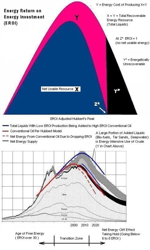
As we again are coming up against the problems of peaking oil production, which may be coming off the end-of-the-world hold of two years ago, we should be studying the works of M. King Hubbert. Hubbert, a geophysicist, used empirical math to quantify the actual behavior of oil fields as opposed to all the geophysical theory that was his industry standard. His predictions differed from the industry, and this earned him the undying derision of his colleagues and indifference from the rest of the world. But his projections have been transpiring in history very close to his time-tables.
What his global model for conventional crude production did not account for was the radical decline in net energy as peak is passing and what happens after that. Net energy was not a concern back in the 1950s, when he did his work. But knowing what we know now about EROEI (which isn't near enough) we could perhaps take the liberty of estimating a net energy adjustment to his basic global curve. It would look something like this: (click on graph to enlarge)
The first chart is the basic effect of net energy on the peaking curve. As you can see, it is a nonissue for the many, many years coming up to the peak. But as peak is passed, it fast becomes a really big deal. That's what we, particularly in America, are going to be gradually waking up to in the coming years. And I'm afraid it will be a little too late. We may be dealing with chronic 3 digit oil pricing before we learn to deal with EROEI.
As the time frames above show, we could be going into a net energy collapse (to the Z* point on the graph) long before actual oil production declines very much.
This makes the net energy numbers on all our nonconventional crude additions that we are tossing on top of the total liquids curve very critical. It will decide where the narrow blue curve in the graph above runs, either with low EROEI and close to the red dashed line, or with high EROEI and close to the fat blue line of the total liquids production. The science of EROEI has come on to the stage and it will either be the villain or the hero. Our Congress is doing all they can do make it be the villain.
Wednesday, November 17, 2010
OK, Gold Correction Back On
Gold correction for November NOT aborted. To proceed per original fractal forecast. That forecast was for gold to have a weak spell up to around late November. Then a power climb to year end. It seems that silver wants to lead this upcoming charge, it has been much more extended on the upside lately. The gold/silver ratio is charging lower (see my previous posts) and silver, the higher beta of the twins, is so far being more muted on the downside in this pullback. The switch-over from silver under-performing gold to a sharp out-performance that began about a month and a half ago seems to be on course. This is the typical case for gold's mega moves - a severe catch-up climb for silver.
Saturday, November 6, 2010
Gold Correction Aborted
I wrote a piece back on October 18 about gaming the next gold correction anticipating a minor one for two or three weeks at least. Sure enough, the very next day, a correction started. It seemed to be advancing properly up until the "B" part of your standard abc corrective pattern that gold has been following up until now. But then it started behaving most improperly.
As the chart shows, as we started down from the "B", the market seems to have said,"OK, forget the rest of this correction. Let's get on with it." I suspected that maybe this pull back wasn't going to make much headway going into the sea of green building on the money flow chart. There is a big difference in buying pressure between now and July, when gold did its last "proper" correction. There was, however, much higher selling volume than buying volume as in a continuing correction. But the intensifying buying pressure seems to be snuffing out the effects of these profit takers.
This looks like an intensifying climb where the pull backs will be hard to figure.
Monday, November 1, 2010
Is Silver Money ?
Gold is a metal that is garnering some attention these days as the "alternative currency" while the world seems bent on debasing all other currency. Historically, that has been gold's main utility, whether you show it off as a necklace or put it in a bank - it has been money down through the ages. But what about silver? We haven't made coins out of it for decades. It's commonly referred to as "the poor man's gold" and gold's ugly cousin and other derogatory phrases. And since the age of electronics has set in, 90% of it is used for such inglorious things as connections in our gizmos, which wind up at the bottom of our landfills.
It wasn't always like this for silver. The Greeks honored silver 2500 years ago by making it into coins, and, in fact for the next 2400 years, silver was the main means of exchange in daily commerce. Gold was used mainly just for big international trade or money actions between banks. As Milton Friedman once noted. "The major monetary metal in history is silver, not gold". It was 30 pieces of silver that betrayed Christ. If you look at the Bible or any old writings where the monetary metal pair is mentioned, it is typically "silver and gold" - not as we say today "gold and silver". It was today's ugly cousin who was the belle of the ball back then.
Is there any reason why silver, or gold, was viewed as money? Well, both metals are very rare. There are the so called "rare earth" elements, but they are actually quite abundant compared to gold and silver - just not as abundant as the base metals. So the monetary pair was given the status of the basis of exchange and the value ratio between them was set at around 15 - the gold/silver ratio (GSR). This ratio has become the subject of a lot of investor interest in our time as we try to value precious metals. There is geologic reason for the GSR being around 15 -17. Silver is 17 times more abundant in the earth's crust than gold on a parts per million basis.
The first few congressional coinage acts in America specifically set the gold/silver ratio at various numbers around 15. And even the Greeks set their ratios in the low teens. Governments have gone back and forth between silver and gold or both (bimetallism) as to what they set official money supply by. It turned out to be a complicated mess with both metals legal tender. When one metal price rose above the other, coins were melted down. But all money, especially the silver backed common exchange pieces, remained metal backed.
Then during the Civil War, Lincoln issued Greenbacks without metal backing to temporarily finance the war effort - our first paper money and our first adventure into fiat money. This instigated the "free silver" movement where the vast new silver finds in and around Nevada were argued as sound money expansion of the money supply. "16 to 1" became a hot political slogan of "the silver ticket". We endured this bimetallism approach to money with various coinage acts of Congress for most of our history. It was just from 1900 to 1971 that we were on an official gold standard. In the US of the late 1800s the rural farming population with a lot of debt and nagging deflation wanted bimetallism, a big debate of the day and the big issue in the 1896 presidential election.
The free silver rebels wanted both metals as money supply, the more ounces the better - a kind of early easy money policy, but all metal backed. It's been rumored that this debate was reflected in L. Frank Baum's "Wizard of Oz" originally published in 1900. The yellow brick road (gold) was originally traversed with Dorothy's silver slippers, later changed to ruby red. The "Oz" is thought to be a reference "ounce". But bimetallism, with all its complications, faded to a Congressionally mandated gold standard in 1900. Money supply was, however, expanded per the cries of the silver supporters with the issue of silver certificates backed by silver from 1878 to 1964 to circulate alongside the gold backed notes. But a movement away from the historical "silver as money" paradigm had begun. This really started us on a road past Dorothy's scarecrow of loose money that has strayed away from pure metal money to disruptive bouts with other types of money. Not long after the gold standard decree of 1900, we had currency mayhem. The Panic of 1907 resulted in the creation of the Fed in 1913 and, well, the rest is history :
This long-view chart shows what has happened to the gold/silver ratio since those days. It's basically been a story of the alternating periods in history where either paper was viewed as money or metals and hard assets in general were viewed as money. Wars, for whatever reasons, seem to bring the money view back to monetary metal and wind up putting the GSR back at 15. But disenchantment with paper bubbles sure seem to do the trick every time as the chart shows in the aftermath of 1929 and 1999. When we got away from making coins out of silver in the 1960s, we also ended the silver redemption of our bills that had "silver certificate" printed on them. Currency mayhem soon followed. It seemed like inflation was an unstoppable force ending the world as we knew it in 1980.
During the last portion of the great gold bull market of the 1970s, when metal again came to be viewed as money, there was a swift return to 16 to 1 on the chart. Silver has the tendency to lag the big moves in gold, then do a very swift catch-up move. This seems to be playing out now with our current gold market:
The red line is the gold/silver ratio, and it amazingly heads straight to the ancient 16 to 1 as the investor view is turned up to maximum "metal as money". If this happens yet again, it would put silver at $125 if gold were to go to $2000. That is a 400% gain on silver as compared to a 50% gain in gold. Fine tuning the gold/silver view even further, we see a sharp technical break in just the last month:
This indicates that the silver explosion over the latter portions of big moves in gold is starting.
But could we really drive silver to such outdated monetary levels? Consider that only 10% of the stuff goes to the investment market, and we are off any gold or silver standard now. Well, that was the case in 1980 and it didn't keep "16 to 1" from rearing its barbaric head. If you are wondering if we really equate silver with money nowadays, you need not look any further than an R-squared analysis between gold and silver prices of the last few years. Gold is clearly the money metal, and silver, despite having vastly different practical use fundamentals than gold, trades in near lockstep with gold with R-squared values around 0.96 (1.00 is a perfect correlation). Gold doesn't correlate this way with copper, sugar, or anything. Adrian Douglas has an excellent article at silverseek.com where he plots silver and gold prices from the last 6 years. He derives an equation just from the plots with the gold price as input and the silver price calculated solely from the gold price. He then plots a "synthetic" silver price (from the equation) and overlays this with the actual price chart for silver - the two graphs are nearly identical. He concludes that big money interests determine both the gold price and silver price. They view both as money nowadays.
Is silver money? History seems to say it was and is and will be the most basic money. We may be missing a passage in the Bible that reads, "Thou shalt be smitten with great calamity as thy path strays far from 16 to 1". In a world where all currencies are being debased, questioned, and abandoned, what if I told you there was a money that has been present and stable since the beginning of wealth, and that will give you 8 times the gain of gold as people flock to it? Silver may be just that.
Wednesday, October 20, 2010
China's Drag On The Market
I keep hearing and reading about how the market's outlook would be so much better without those darn Chinese. Yesterday you read that China sparked a sell off with their raise of interest rates. I've heard that the Chinese economy can't do well without the US consumer doing well, and we all know the US consumer of yester-year isn't coming back soon. As China goes, so goes the world, and the Shanghai has been in a sustained downtrend for over a year, being far in the red YTD. Well, take a peek at what's happening now.
William O'Neil, founder of IBD and a pretty sharp technical analyst, would look at this chart and have a cup and handle bottom reach off the screen and slap him. The handle is a little too long, but it's breaking, which would suggest that China's market is resuming a climb . China is moving to prevent bubbles. They are not stupid like our US leadership, so, yes, they are raising rates. And they are distancing themselves from not only US fiscal policy, but the US consumer as well, becoming a trading partner to the world.
Their stock market has spent most of this year below the critical 140 day ema (blue line) but has now regained the territory above it and turned its slope back to positive. China does indeed tend to be a harbinger for the rest of the world. Note that the bear decline for the Shanghai ended in October 2008. So the cup and handle breakage would predict a continued climb for global stocks. Other harbingers, like the QQQQ and the US transports are well above their April highs and point in the same direction for the broad market. China a drag on the market? Well, maybe not right now.
Sunday, October 17, 2010
Gaming The Next Gold Correction
Gold has had a good run lately, and that begs the question, "When is the next correction and should I try to sell and buy back around it?" It's pretty easy to know when a correction is nearing. If you believe in the fractal voodoo, a one month correction is due to start around the end of October. It is of the type after a 64 day cycle that occurred in July this year, not the big four month type that started last December. So why not be clever and dance around it?
Well, if you had been clever enough to dance adroitly around the last two corrections, both the big one and the small one, this is how you would have done in all that tracks the price of gold (click on charts to enlarge):
It would have been worthwhile, putting you 7.7% and 5.5% ahead of a continuous hold. But when you try to apply this cleverness to individual gold stocks, this is the very typical result:
The cleverness backfires and instead of you gaming the corrections, Mister Market games you. And that's if you had timed both corrections to near perfection. In real life, that ain't likely. This doesn't happen with every stock, but it is the very typical case with the very small stocks (LODE, TRE, GBG, GRZ are some other examples). This is because the small miners have their stocks moved much more by their own individual property stories than by the short term fluctuations in the price of gold. It is a much bigger deal to them if a property is making good strides ahead than if gold goes $100 higher or lower. The big mature miners with a huge portfolio of producing properties see their stocks move much more in unison with the price of gold and silver. Trying to game corrections makes much more sense with them. But with the smaller miners, it becomes much more a roll of the dice.
As for a portfolio management strategy for gold corrections, it may make sense to raise cash with the gold and silver ETFs and large miners if you're attempting to trade as opposed to indiscriminate selling. When you are holding a quality junior miner, you are holding a development story that will jump the price of the stock at the most inconvenient of times for you as a trader.
Monday, October 11, 2010
Maybe The Best Gold Stock You Never Heard Of
I've always held a deep respect for the thorough discounting efficiency of the stock market. In fact, my main analysis method depends heavily on it. So I tend to sneer at the "undiscovered gem" approach - "Oh, the market has discovered it, fool, and it knows more about it than you do" is my reaction. So, it is with a sense of uneasiness that I present to you an undiscovered gem.
Sante Fe Gold SFEG seems to be such a gem. It most certainly is undiscovered. Even amongst the small juniors, it is about the most unheard of, stealth gold stock priced above $1 I have ever run across. About the only people grabbing at it are the insiders, and they really like it. At an IH (insider held) factor of 35%, it is the 3rd most heavily insider held gold stock I have found (behind GORO and BVN) among the 60 or so I track that trade on US exchanges. And it's all officers who own, not funds or other companies, and some of the heavy handed buying has been just in the last year or so.
About the only hoopla one finds is some write-ups at investor village wherein they explain:
It has made much higher levels since mid '08, which is more than you can say for almost all the miners - a nice sustained uptrend that correlates well with the gold moves. It looks to be organizing for another sling shot move up with the current gold move:
Sante Fe Gold SFEG seems to be such a gem. It most certainly is undiscovered. Even amongst the small juniors, it is about the most unheard of, stealth gold stock priced above $1 I have ever run across. About the only people grabbing at it are the insiders, and they really like it. At an IH (insider held) factor of 35%, it is the 3rd most heavily insider held gold stock I have found (behind GORO and BVN) among the 60 or so I track that trade on US exchanges. And it's all officers who own, not funds or other companies, and some of the heavy handed buying has been just in the last year or so.
About the only hoopla one finds is some write-ups at investor village wherein they explain:
The average cash cost of production in the industry is about $580/oz for gold. I've seen figures of around $250 and $300-$400 projected for Sante Fe. It's been tabulated that M&A pricing metrics, as shown by the recent Andean Resources buyout, puts SFEG's current $1 stock at $36 by the same reserve oz valuation.And how did all this come to be? Essentially it has been borne out of an extremely conservative management style intent upon under-promising and over-delivering, that with little fanfare has been quietly and methodically acquiring additional properties at every opportunity, that not only hold great value already, they also hold additional superb upside discovery potential and at the same time sought to downplay expectations with initial extremely conservative projections based on $650 - $850 Gold prices along with conservative output projections and the prospect of better than expected grades, that might actually have a much better than expected impact, not only on the initial Gold and Silver output projections, but also on the bottom line due to what might be larger cost savings, along with a multiple increase in production, that has basically set the stage for an unexpectedly large increase in revenues, that a short time ago, did not even seem remotely possible even to us: And so now it appears as if the impending prospects of all this has certainly vindicated our judgment and decision to select SFEG as our preferred means of investing in Gold and Silver, with perhaps among the most upside leverage and potential for the coming year and early in this decade as we attempt explain further and offer some background as to how we came to this decision quite some time ago.And because we've had experience of this before, when we were able to identify extremely undervalued positions in both mining and other issues that were able to gain exponentially from similar, albeit much lower multiplier effects that still turned out to be very successful investments. With our track record of identifying ahead of time and capturing much of half a dozen up to 100 fold mega-winners this past decade We honestly have not seen a better, clearer or more easy to project so well ahead of time situation than Santa Fe Gold and re-iterate: Very few times in life are you ever likely to be faced with the prospect of being able to gain from a multiplier effect that you can see so clearly ahead of you especially any financial or investment multiplier because as you continue to evaluate Santa Fe's prospects
I've read a lot of complaining about the company's public relations efforts (or lack thereof). But they may be trying to fix this starting with an investor conference call this Friday. All of Sante Fe's operations are in the Southwest US and do not involve any geopolitical problems (unless Obama nationalizes the mining industry). Technically, the stock looks pretty interesting:In support of all this, 26 institutions considered Santa Fe to be a compelling enough investment proposition at $1.30 per share earlier this year and SFEG reached a high of $1.74. Therefore, since the fundamentals of the company are already substantially better today than they were then, with increasingly strong revenue growth forthcoming, Santa Fe would appear to be a rare and uncommonly undervalued and opportunistic anomaly in the current marketplace, in particular when compared with its peers.And with an additional 65 institutions or so that have either met with management personally, or by phone conferences and are now monitoring Santa Fe in expectation of an AMEX listing before too long, as Santa Fe continues to execute and potentially over-deliver, a real buying stampede in this issue could ensue, especially as important resistance numbers are taken out on the upside and most importantly, once new 52 week highs are reached and beyond new all time highs. And in addition to all of this, the company has already stockpiled more than a year's worth of production, presumably with all the intent to compress more than two years production into one and ultimately, ramp up in multiples of 400 tons per day sooner than anticipated, thus affording them a head start towards increasing to 1,000 tpd plus and very significant revenue growth.Sometimes it takes the marketplace time to factor in all of the information at hand and much of what is written above may not yet have been assimilated by all investors, but a few are beginning to get the memo and increasing numbers could begin to realize just how truly undervalued Santa Fe really is that at some point could create a rush on the stock and a bottleneck situation where demand for stock would overwhelm supply
It has made much higher levels since mid '08, which is more than you can say for almost all the miners - a nice sustained uptrend that correlates well with the gold moves. It looks to be organizing for another sling shot move up with the current gold move:
Tuesday, October 5, 2010
The Next Megatrend
I have found that investing is most easily done by identifying megatrends and working mostly within that area of the market with individual stock analysis. Studies have found that half of a stock's movement is a function of what its sector is doing. So if you're right about the major sector trends, you take positions in the best stocks and let them ride and trade only for very good reasons - "be right and sit tight" as the saying goes.
Gold is the megatrend right now. But all megatrends end. So what's after gold? If you're an investor who attempts to correctly switch horses when they die, you need to be thinking ahead and preparing to mount the next horse when the one you're charging ahead on is shot out from under you.
Before we consider what could possibly emerge as a megatrend after gold, let's first think about the shooting of the gold horse. I suppose the first thing that comes to mind when thinking about the end of something as hot as gold is your classic blowoff top followed by a catastrophic collapse that goes on for many years. This is what is thought of as coming after a parabolic rise. Isn't that what the Nasdaq of the 90s did and gold in 1980? Well, I would direct your attention to my previous article "The 64 Month Bull Market Fractal" to point out that the parabolas sometimes end that way, but can end with a jarring disconnect from the parabola followed by continued high range pricing and new highs - just without the nice smooth parabola. There is a current article over at Kitco by Chris Blasi suggesting that the macro economic conditions are so different now from 1980 that it almost dictates a different outcome in this gold bull market:
So what about a new megatrend to watch for? How about oil? When oil was passing $80 a barrel two years ago, it was about the only game in town and funds were loading the boat with it. All the oil bears were crying "speculative bubble", and when the financial collapse came in '08, it was just that - everything was a collapsing bubble then. Now oil is passing $80 a barrel again, and oil and the energy stocks are underperforming just about everything. They are the dog of the day now. You certainly can't blame the pricing on a frothy frenzy this time.
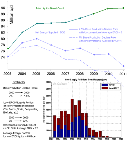
I think the price of oil may surprise and confound what I call "the barrel counters" - the energy planners who by and large are blind to the net energy crisis brewing in the world. They don't understand the profound decline in net usable energy coming from the industry. If you tabulate a real net usable energy curve, which used to be about one and the same with the raw barrel count, you get this disturbing picture (click to enlarge):
A sharp divergence between net energy and official barrel count began to emerge in 2005 - about the time the price of oil started going crazy. The Great Recession has perhaps camouflaged the real usable energy supply shortage since 2008. But now we have a recovering global economy matched against a steepening divergence between usable energy and barrel count - a double whammy that could bring three digit pricing back before we think. Crude alternatives are stepping in to fill the gap, but probably not fast enough. Oil has been a dog. But I have a hunch this dog will have his day.
Gold is the megatrend right now. But all megatrends end. So what's after gold? If you're an investor who attempts to correctly switch horses when they die, you need to be thinking ahead and preparing to mount the next horse when the one you're charging ahead on is shot out from under you.
Before we consider what could possibly emerge as a megatrend after gold, let's first think about the shooting of the gold horse. I suppose the first thing that comes to mind when thinking about the end of something as hot as gold is your classic blowoff top followed by a catastrophic collapse that goes on for many years. This is what is thought of as coming after a parabolic rise. Isn't that what the Nasdaq of the 90s did and gold in 1980? Well, I would direct your attention to my previous article "The 64 Month Bull Market Fractal" to point out that the parabolas sometimes end that way, but can end with a jarring disconnect from the parabola followed by continued high range pricing and new highs - just without the nice smooth parabola. There is a current article over at Kitco by Chris Blasi suggesting that the macro economic conditions are so different now from 1980 that it almost dictates a different outcome in this gold bull market:
Take a look at the US debt chart in this article and visibly compare 1980 to now - a vastly different condition as to its rapid healing prospects. So the shooting of our gold horse may actually be more of a moderate hobbling - but something to avoid nonetheless.Not a 70's gold bull replay.
True, gold's last bull run gave way to 20 years of price erosion, ratcheting down to the lowly exchange rate of $255 per ounce. Regardless, the US and global economic landscape of 2010 is vastly different than that of 1980. Today's exponential growth of sovereign debt is straining confidence in faith based currencies, particularly one which holds the mantle of world's reserve currency. This current debt differentiator, in conjunction with a myriad of other issues inhibiting US economic growth, is substantial enough to reasonably assure investors of a strikingly different course and conclusion to this gold bull.
So what about a new megatrend to watch for? How about oil? When oil was passing $80 a barrel two years ago, it was about the only game in town and funds were loading the boat with it. All the oil bears were crying "speculative bubble", and when the financial collapse came in '08, it was just that - everything was a collapsing bubble then. Now oil is passing $80 a barrel again, and oil and the energy stocks are underperforming just about everything. They are the dog of the day now. You certainly can't blame the pricing on a frothy frenzy this time.
I think the price of oil may surprise and confound what I call "the barrel counters" - the energy planners who by and large are blind to the net energy crisis brewing in the world. They don't understand the profound decline in net usable energy coming from the industry. If you tabulate a real net usable energy curve, which used to be about one and the same with the raw barrel count, you get this disturbing picture (click to enlarge):
A sharp divergence between net energy and official barrel count began to emerge in 2005 - about the time the price of oil started going crazy. The Great Recession has perhaps camouflaged the real usable energy supply shortage since 2008. But now we have a recovering global economy matched against a steepening divergence between usable energy and barrel count - a double whammy that could bring three digit pricing back before we think. Crude alternatives are stepping in to fill the gap, but probably not fast enough. Oil has been a dog. But I have a hunch this dog will have his day.
Tuesday, September 28, 2010
The 64 Month Bull Market Fractal
I don't know how familiar you may be with the emerging science of fractal market analysis, but there is an element of it that has a direct bearing on gold right now. To briefly overview fractals, they have found that stocks and indexes have a strong tendency to move in repeating chart patterns at various scales (self-similar, they call it). So a stock may consistently produce say a 2 year pattern which is also evident at a 2 month time frame. Sounds silly, I know. The theory is that there are well known fractal growth patterns in nature, crystals growing under a microscope and about any basic growth in nature; and these are abundant with self-similar, geometric, repeating patterns. They've known about these nature patterns for many decades, but only recently has anyone thought that financial markets may grow by these fractal patterns too. When they investigated, they found that the unchanging human nature did indeed infuse fractals into the trading charts.
David Nichols, a pioneer in this investigation, finds that there is a 64 month parabolic fractal signature that seems to show up at about every major bull market. The duration varies a couple months or so, but the pattern is a "sprouting" of a parabola, a bullish change in previously sleepy trading, followed by parabolic growth into a violent top about 64 months later. As an example, he points to Toll Brothers as a proxy for the housing bubble (click to enlarge charts):
The months are marked 1 through 65 for the parabolic progression. The Japanese Nikkei bubble of the '80s did the same thing:
I won't flood this piece with the other charts, but the same thing shows up in the Dow of the 1920s, the Nasdaq of the 1990s, and other bull markets. It also shows up in the more notable bull crazes of individual stocks. For example, Intuitive Surgical ISRG was such a craze:
Here the "sprout" of the parabola was a subtle change in trend from sideways or down to up.
Then there was Hansen Natural HANS, remember that hot potato?
Like the Nasdaq chart, the gain was so dramatic, you have to magnify the start point area to see the "sprout" point:
So what does all this have to do with gold today?
Nichols reckons the change in behavior "sprout" point as September 2005, although gold was already in an uptrend by then, but a very weak one. Since this chart was done, we have pretty much been following the fractal.
The end of this gold parabola is early 2011. This brings up some difficult questions. If the gold bull market is to end in 5 months, does that mean the entire commodities bull also dies in 5 months? It's hard to imagine a commodities bull without gold being a part of it. Do all the world's debt and currency problems go away in the next 5 months? That would be nice, but I somehow doubt that will happen. The hard assets/paper assets cycle runs about 12 to 18 years; our present commodity cycle is barely 9 years old with much more paper difficulty lying ahead:
So how can it be that the 64 month gold fractal is happening now, ending in 2011 and disrupting the cycle?
I'm not a fractal expert, but it strikes me that the parabola is just a part of a bull market, and it can occur either in the middle or at the end. In the case of the Nasdaq and the Nikkei, it occurred at the end. In another case that Nichols points out, the recent oil bubble, you have to seriously doubt that the bull market is over. There definitely was the parabola:
The parabola is clearly history. Does this mean that oil will never be over $100 again? It has already gone back to over $80 during a recession and its aftermath. At some point in a recovering global economy, demand will begin outpacing supply as it was starting to do 4 years ago.
If you examine the Intuitive Surgical and Hansen Natural charts above, you see that once the parabola phase was over, pricing remained high - even making new highs. I suspect that this will be the case with both gold and oil.
Sunday, September 19, 2010
Cancel Breakout Alert
Continental Minerals is being acquired by Jinchuan Group it was announced Friday. There shouldn't be much more rise in the stock as it is near the present buyout price (I hadn't seen the announcement yet on Friday when I did the previous post). An agreement has been signed, it looks like a done deal.
Wednesday, September 15, 2010
Breakout Alert
Continental Minerals (KMKCF) is a junior Canadian gold/copper/silver miner that mines in China. From what I read, they have a promising property there with well over 4 million oz. of gold and 11 million oz. of silver. The stock seems to be doing a promising breakout (click to enlarge):
Since the big gold rally late last year, in which KMKCF participated nicely, the stock has been idling in a megaphone formation. After a false breakout in April to about $2.50, it may have completed this formation today with a real breakout with some building volume. I like the moving average geometry and the heavy 24% insider interest. If it doesn't do a breakout now, it probably will soon if gold keeps working its way higher.
Sunday, September 12, 2010
Quantifying The Insider Edge
As a follow-on to the importance of insider ownership level in considering gold stocks discussed in my previous post, I'll present a little number crunching here. I looked at a bigger sample size of gold stocks than just the 10 listed before with their big out-performance of the HUI to get a better handle on the relation, if any, between insider ownership level, size of company, and stock performance. I tossed out the ultra-microcaps less than $50 million or trading for less than 50 cents. I also tossed out the slower moving majors, with insider percentages typically not much effected by insider buying. I took a sampling of 51 such gold mining stocks from my gold list that trade on US exchanges with SEC standards of reporting. I sliced and diced this group into 3 market cap sizes and plotted their 1 year stock performance vs level of insider interest. Here is the result:
There is much less sensitivity to company size than I was expecting to find. The middleweights move about as fast as the featherweights. There is also little sensitivity to price range. I was expecting to find that as you go down the price range, the heavily insider owned stocks would curve sharply up in gain - down to the trash threshold, which is around $2 for stocks in general, but seems to be more around $1 for gold stocks. When I did a cluster chart for this, however, I got essentially random clutter.
The one big sensitivity that reaches off the page and slaps me in the face is what happens as you go below 2% insider interest level - a huge booby trap for performance. The individual stock performances vary widely, but this is an extremely poor averaging group - to be avoided like the plague. The large size group doesn't fall off as bad as the other two, but their size could be masking decent insider interest in many cases without having the needle moved much in percent. But the smaller companies, where any serious insider interest moves the needle off zero, are poison at these small numbers.
I have three chronic pains in my gold stock line-up in my fund, I call them the three stooges, and when I checked what their number was, sure enough all three stooges were toting less than 2%. That may be the last straw for them.
Sunday, September 5, 2010
The Problem With Gold Stocks
I like to analyze stocks by looking at a company's long-term financial results - cash flow, revenue, and what not, and looking at the interplay of these things with stock price. But I have found this approach to be all but useless in picking gold stocks. The performance of gold miners has nothing to do with their current financials other than simply having enough capital to pursue their projects. You see valuation ratios all over the map during their big climbs, much more so than with any other type of stock. They defy about any monetary type of analysis that may work reasonably well on stocks in general.
So how do you analyze the miners other than projecting the price of gold? Well, you have to resort to leaning on the expert opinion from the people who know more about gold mining than you ever will. These people can be book writers, commentators, newsletter writers, or Ralph, your barber. But all these people suffer from one or both of two key shortcomings (1) they are not geologists and (2) they are not officers of the mining company. It stands to reason that these are the people who know at least as much as the most informed newsletter writer, and probably more. I wouldn't think the company's officers surrender all the key information they possess to anyone on the outside.
So how does the average Joe Investor glean guidance from these people in the know ? First, you can get a feel for how good a management is by just looking at their stock performance over the course of the gold bull market so far. If the stock persistently shows little correlation to a rising gold price over the years, you have to wonder about the market's judgment on the management's ability. If the stock is to take advantage of a future rise in gold's price, it means this company's leaders are going to have to suddenly find a lot of new gold or change their management stripes. The odds are against both. I ran across a thoughtful piece in the archives at kitco.com "Industry Overview: Gold Mining & Exploration" by Derrick Irwin CFA that discusses this dilemma of gold stock analysis. His take:
How is this strong insider interest line up playing out over the past year ? Well, if you take the top 10, leaving off the low 11% of Midway, a lot of which is recent buying; and figure this portfolio's performance, you get +65% vs about +19% for the HUI gold stock index since this time last year.
The problem with gold stocks is you can't depend on our trusty valuation ratios, cash flow curves, or other normally useful parameters. Gold stock value is not about money put on past statements, its all about pulling future ore from their properties. You have to analyze the price of gold with all its complexity and danger. But most importantly, you must look inside the minds of the people who run the companies.
So how do you analyze the miners other than projecting the price of gold? Well, you have to resort to leaning on the expert opinion from the people who know more about gold mining than you ever will. These people can be book writers, commentators, newsletter writers, or Ralph, your barber. But all these people suffer from one or both of two key shortcomings (1) they are not geologists and (2) they are not officers of the mining company. It stands to reason that these are the people who know at least as much as the most informed newsletter writer, and probably more. I wouldn't think the company's officers surrender all the key information they possess to anyone on the outside.
So how does the average Joe Investor glean guidance from these people in the know ? First, you can get a feel for how good a management is by just looking at their stock performance over the course of the gold bull market so far. If the stock persistently shows little correlation to a rising gold price over the years, you have to wonder about the market's judgment on the management's ability. If the stock is to take advantage of a future rise in gold's price, it means this company's leaders are going to have to suddenly find a lot of new gold or change their management stripes. The odds are against both. I ran across a thoughtful piece in the archives at kitco.com "Industry Overview: Gold Mining & Exploration" by Derrick Irwin CFA that discusses this dilemma of gold stock analysis. His take:
We believe the most important factor to consider when evaluating an exploration company is the quality of management. In analyzing mining companies, we evaluate managements' experience in the exploration industry, and their track record for discovering gold deposits in the past. This is particularly relevant in regards to the geology team members, who will need to make important decisions regarding where to look for gold anomalies and how to proceed with drilling. On the management side, can the team attract continued investment to fund ongoing exploration activities?But there is perhaps a more direct way of tapping the knowledge and confidence of the management of a public mining company - insider buying and ownership level. They are putting their money where their knowledge is when they make these publicly available transactions. When these people place their personal money with an individual company in an arena where individual stock performance is very shaky, it means something. Irwin's opinion:
In our view, significant insider ownership is one of the most promising indicators of a healthy exploration company. Management is close to the exploration process and clearly understands how encouraging exploration results actually are, or what the status of agreements with vendors and development partners actually is. We also view management participation in follow-on offerings as a sign of continued faith in the prospects of an exploration company. We do not look at a "threshold" level of management ownership, but we do place higher value on larger ownership percentages. Also, we look for depth of ownership among management - does the whole board and management team hold significant shares, or are the shares concentrated in the hands of a founder or one large owner? A strong board and management team with significant share ownership is one of the most positive signs that an exploration company is healthy, in our view.With that in mind, I surveyed the miners that report insider activity (in the US anyway) and found some that currently have unusually high levels of insider held shares. Here is the top tier:
AZC Augusta Resource Corp 20%Midway Gold is the laggard of this group with 11%, but a whopping 64% of that insider ownership level has come about just over the last two years - a lot of recent insider buying.
NSU Nevsun Resources Ltd. 20%
XPL Solitario Exploration & Royalty Corp 15%
MDW Midway Gold Corp 11%
TLR Timberline Resources Corp 22%
PZG Paramount Gold & Silver Corp 34%
UXG US Gold 25%
GORO Gold Resource Corp 49%
NG NovaGold Resources Inc 32%
ANV Allied Nevada Gold 35%
RBY Rubicon Mineral Corp 21%
How is this strong insider interest line up playing out over the past year ? Well, if you take the top 10, leaving off the low 11% of Midway, a lot of which is recent buying; and figure this portfolio's performance, you get +65% vs about +19% for the HUI gold stock index since this time last year.
The problem with gold stocks is you can't depend on our trusty valuation ratios, cash flow curves, or other normally useful parameters. Gold stock value is not about money put on past statements, its all about pulling future ore from their properties. You have to analyze the price of gold with all its complexity and danger. But most importantly, you must look inside the minds of the people who run the companies.
Saturday, September 4, 2010
Are Smartphones A New Recession Play ?
By past investment norms, you wouldn't think an expensive electronic gadget would be considered a secular growth investment to fall back on in a weak economic time. But expensive electronic gadgets have insidiously wound their way into the fabric of our daily lives since past recessions. The coup de grace to the old view of gadgets has to be the smartphone. We have come to depend on these just like our bar of soap in the shower. Companies like Apple have become the new Procter and Gambles, only faster growing.
Along with this changing view of secular growth, Wall Street is coming to the morning after realization that delevering down from the debt binge is going to be a chronic condition afflicting the investing world for some time to come. "Derivatives" used to be thought of as a good and sophisticated thing. Now, when CNBC's in-house rock band thinks up a name for themselves, they come up with "The Derivatives". It reminds me of that episode of the old Dick Van Dyke Show from the mid '60s, when bands first started naming themselves after the most unsettling, disgusting thing they could think of. Rob was second guessing the naming of a band, wondering why they hadn't called themselves "The Festering Sores".
Derivatives and their aftermath are going to be a festering sore for us for a long time to come, unfortunately. So whatever the good secular growth investments are, that's what we want. Smartphones and gold are two that come to mind among defensive, but fast growers. CBS news.com ran a smartphone article last week calling them "seemingly recession proof" and running into the problem of not being able to get enough chips from a chip industry underestimating Jim Cramer's "smartphone tsunami". Cramer seems to be right about what he said well over a year ago - that everyone was underestimating it. He felt so strongly about it that he made up a whole separate stock market, a smartphone index, on August 11, 2009 to show off it's market beating performance. I thought it was a neat idea, because I agreed with him that the market was underestimating it. But upon perusing through the tech stocks, I found some that I felt should be in any such index that he didn't include. So I jotted down a list and called it the "supplemental" index.
So is this index beating the market over a year later? Well, let's see. If you had invested $10,000 in each name, here's how they would have done (as of Sept 2):
Original Index
+ 5694.68 STAR (merged)
- 5777.46 PALM (merged)
+ 1228.08 CIEN
+ 2096.77 TLAB
+ 3956.40 ADCT (merged)
- 3148.23 TKLC
- 2230.68 CTV
- 1211.65 QCOM
+ 2255.40 BRCM
+ 2849.55 NETL
+ 1784.10 XLNX
+ 5247.34 SWKS
+ 833.32 RFMD
- 1200.00 ONNN
+ 1057.65 CY
- 3725.90 TSRA
+11487.36 SNDK
- 377.36 CSCO
+ 176.24 GOOG
- 3869.73 RIMM
+ 5394.40 AAPL
_________
+22520.28 on $210,000 +10.7% vs +8.6% f0r S&P 500
My Supplemental Index
+ 1481.48 WRLS
- 769.20 NTE
+18003.60 ARMH
- 20.00 CHA
- 370.37 SYNA
+ 357.15 CHU
+ 1842.87 LLTC
+ 7459.27 OVTI
+ 16367.93 AKAM
+ 5999.64 CREE
- 2000.00 ERTS
- 833.30 STX
__________
+47519.07 on $120,000 +39.6% vs +8.6% for S&P 500
Combining the two lists together, we get +21.2% - a serious outclimbing of the market, but taking a back seat to gold's +31.8% over that period. Let the bad times roll!
Wednesday, September 1, 2010
Simulations Plus Is Worth Watching
There aren't many stocks outside the gold universe that reside on my "A" list, but this is one of them. Stocks in general seem to be in a condition where they get jerked around by the latest fret or relief rally over global finances. Finding those that are dancing to their own music these days is tough. Simulations Plus (SLP) is a tiny company that seems to be doing just that. They in a good area of the market, "para-pharma". They assist drug companies with research programs, so they aren't that economy dependent. And the healthcare overhaul uncertainty storm has blown over. It's technical condition presents a plethoria of positives:
In addition to a nice looking cup and handle bottom, long since completed, it has been working on a resistance level at around $2. Earlier this year, this resistance was broken then successfully tested as support. This seems to be one of those stocks that likes to sneak up on investors and clobber them with a big climb after they've left the building. The chart shows the big moves up only after volume has gotten very quiet. It is at such a stage right now. It's trading close to a parallel 140/200 ema that has established a smooth uptrend. The stock was totally oblivious to the nasty tumble in February and the dive after April.
Fundamentally, eps has been in a steady climb since '05 with only a mild interruption in '09 (up over 100% in 5 years), and the ttm eps is up from '07 while the stock has been smashed from $8 to less than $2. Debt is zero, current ratio over 9, and the insiders love it, carrying a whopping 47% of the shares.
It's no gold stock, and it's not smartphone, but maybe the next best thing.
Sunday, August 15, 2010
Another Iran Worry
This week, we investors must pass through another one of those heightened geopolitical risk windows over the Iran/Israel stand-off. I've posted on some of these. Russian is delivering the fuel to operate the Bushehr nuclear plant August 21. Speculation is that an Israeli strike will be done before the plants are filled with the fuel that will make a radioactive mess if bombed. This may kill millions in heavily populated neighbor regions. Israel hit the other two nuclear plant threats, the Iraqi plant in '81 and the Syrian plant in '07, before they were supplied with fuel. So we are in a danger zone. Late 2009 was such a zone when the Obama initiated enrichment offer was put together - then rejected by Iran. Israel now seems to be waiting, perhaps on the MOP bunker busters from Boeing, said last year to be ready by July, 2010. Or perhaps they are waiting on American efforts at disrupting Iran from within. There is a large article out this weekend in The Atlantic titled The Point of No Return. The informed opinion presented here leans toward more forbearance (more waiting) by Israel over the coming months.
You would think, as John Bolton does, that Isarel is constrained to make their military move before any plant fueling. But the radiation mess is just one of many messes being weighed into the calculus. So we may not be very well served with this week's fueling schedule as a military schedule.
Regardless of when the strike happens, the conscientious investor has to try to anticipate the market implications. You could stay totally out of all markets until a military option is taken. That would have kept you out of the Cold War market from 1957 to 1989. Or you can study what past Middle East blow ups did, and weight portfolios accordingly. If you look at the two most recent Middle East blow ups, Saddam's invasion of Kuwait in August of 1990 and Bush's announcement that we were going to invade Iraq, believed to be chock full of bio and chemical weapons in late 2002, you see that the two beneficiaries are oil and gold. In the 1990 blow up: (click to enlarge charts)
And in the 2002 blow up:
These two time frames were during a bear market in commodities (1990) and a beginning bull market (2002). The geopolitical events caused just a brief detour by gold and oil from the paths they were taking, demonstrating the power of macro-economic trends over geopolitical events. Of course Iran/Israel may be a macro-economic trend changer if it were to occur.
It's worth noting that oil stocks didn't do much over these past shocks, but gold stocks typically did about whatever gold did. So of the four good "shock" investments that come to mind - gold, oil, gold stocks, and oil stocks - we've had 3 up and one down over past shocks.
But, based on my conversations with Israeli decision-makers, this period of forbearance, in which Netanyahu waits to see if the West’s nonmilitary methods can stop Iran, will come to an end this December. Robert Gates, the American defense secretary, said in June at a meeting of NATO defense ministers that most intelligence estimates predict that Iran is one to three years away from building a nuclear weapon. “In Israel, we heard this as nine months from June—in other words, March of 2011,” one Israeli policy maker told me. “If we assume that nothing changes in these estimates, this means that we will have to begin thinking about our next step beginning at the turn of the year.”
You would think, as John Bolton does, that Isarel is constrained to make their military move before any plant fueling. But the radiation mess is just one of many messes being weighed into the calculus. So we may not be very well served with this week's fueling schedule as a military schedule.
What is more likely, then, is that one day next spring, the Israeli national-security adviser, Uzi Arad, and the Israeli defense minister, Ehud Barak, will simultaneously telephone their counterparts at the White House and the Pentagon, to inform them that their prime minister, Benjamin Netanyahu, has just ordered roughly one hundred F-15Es, F-16Is, F-16Cs, and other aircraft of the Israeli air force to fly east toward Iran—possibly by crossing Saudi Arabia, possibly by threading the border between Syria and Turkey, and possibly by traveling directly through Iraq’s airspace, though it is crowded with American aircraft.
Regardless of when the strike happens, the conscientious investor has to try to anticipate the market implications. You could stay totally out of all markets until a military option is taken. That would have kept you out of the Cold War market from 1957 to 1989. Or you can study what past Middle East blow ups did, and weight portfolios accordingly. If you look at the two most recent Middle East blow ups, Saddam's invasion of Kuwait in August of 1990 and Bush's announcement that we were going to invade Iraq, believed to be chock full of bio and chemical weapons in late 2002, you see that the two beneficiaries are oil and gold. In the 1990 blow up: (click to enlarge charts)
And in the 2002 blow up:
These two time frames were during a bear market in commodities (1990) and a beginning bull market (2002). The geopolitical events caused just a brief detour by gold and oil from the paths they were taking, demonstrating the power of macro-economic trends over geopolitical events. Of course Iran/Israel may be a macro-economic trend changer if it were to occur.
It's worth noting that oil stocks didn't do much over these past shocks, but gold stocks typically did about whatever gold did. So of the four good "shock" investments that come to mind - gold, oil, gold stocks, and oil stocks - we've had 3 up and one down over past shocks.
Saturday, July 31, 2010
SinoCoking Stirring Again?
China's SinoCoking (SCOK) is an adventurous stock having been shot up to $2000 and change during the year 2000 period, when anything with a good story and no money went to the moon. Since then, the stock has crashed to about $12 during the 2002 bear, shot up to over $200 in the ensuing recovery, then slowly wilted back down to $12, where it more or less hibernated during the market bottoming of 2009. To wit: (click to enlarge)
It seems to have been a tortuous exodus after 2004 with very strong handed ownership left by the time of the 2008 fiasco. Now the stock appears to be getting noticed by new buyers. During the huge surge to $200 plus of the early 2000s, the PE ranged between 50 and 100. Now with the stock in the teens and dead as a hammer, the PE is like 3 - but its cheapness is gaining some attention. The insiders like it with a 43% ownership level. Back on June 4, TheStreet.com ran a piece titled "Two Undervalued China Coal Stocks" where they featured SinoCoking and Yanzhou Coal Mining (YZC). Unlike Yanzhou, they do primarily steel making coal and chemical processing coal. The stock appeared to be breaking into another of its gargantuan climbs, but the big China Swoon of 2010 threw a flood of cold water on this move. But, as Jim Cramer said this week, the malaise over China may be lifting soon. With big growth stories, you buy the massacres. This probably qualifies as one. It's doing some nice technical things right now:
Transports Winning The 140 Day Tug-Of-War
Back on July 1, I wrote a post I called "A Ray Of Sunshine". It looked at what seemed to me like some Dow Theory nonconfirmation of the technical breakdown of the Dow. Let's look at what I wrote back then:
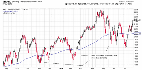
The transports have only briefly punctured the 140 for less than a month at a time, and look like they want to drag the broad market, with the bears kicking and screaming, back to the bull market for now:
A lot has been made of the Baltic Dry Index's sharp dive over the last couple months, and this transport index is a reliable leading indicator. But, as Cramer pointed out this week, this index is being distorted by an unusual ship overbuild situation causing shipping rates to decline (see my March 9 post here "Baltic Index On Leave Of Absence?") The other transports, including container shipping, are doing well but are more of a coincident indicator reflecting smaller lead times in economic activity. So we will just have to monitor these transports and take the longer range BDI forecast with a grain of salt for now. The ship thing just doesn't seem to be a plane and train thing.
A ray of sunshine on an otherwise dreadful market outlook is the condition of the transports and a key tech leader index. These rays really stand out in all the gloom. The debt dominoes appear to be catching up with the rally from 2009. But before we bury the recovery, lets look at something important that is refusing to go along with the gloom so far.
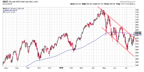
Now to fast forward to the present, we could place a line in the sand as the 140 day exponential moving average (the 200 simple is shown above). The 140 is a good divider of major bull and bear moves if you allow a month or so for transient crossings. In late June, the broad market and the transports seemed to be locked in a tug-of-war with one on bear ground and one on bull ground. Now if we take a peek at the tussle we see this:If you put any faith in Dow Theory (and you should) you want to pay attention to what the transports are doing because for a move to be confirmed in the broad market, it must be replicated in the transports. Quite typically, a change in trend without transport confirmation turns out to be bogus. This has been a reliable indicator since the days when the rails were the main transport. In our day, rails have become much less significant, but recently have taken on the role of a reflection of the commodities market. Coal, and about anything you pulverize and haul, move much cheaper in quantity by rail than by smaller truck units getting 5 mpg in traffic. That's a major reason Warren Buffett is buying up railroads. If you look at how the rails are doing in this bad market (check CSX, CNI, KSU) you see they are still in bull climb mode despite the whacking commodities are taking. To isolate the transports as a reflection of purely economic activity apart from the global commodities market, I like to look at the Nasdaq transports because they are virtually devoid of rails:Here you see pretty much the same thing as the rails show - they both are not confirming the change in trend seen in the S&P 500. The transports are proceeding on an upsloping 200 dma and may have put in a reversal stick on that trend line today. The retail RLX index has been leading the correction down and also has the look of a reversal day being put in at the bottom of a trading channel.
The transports have only briefly punctured the 140 for less than a month at a time, and look like they want to drag the broad market, with the bears kicking and screaming, back to the bull market for now:
A lot has been made of the Baltic Dry Index's sharp dive over the last couple months, and this transport index is a reliable leading indicator. But, as Cramer pointed out this week, this index is being distorted by an unusual ship overbuild situation causing shipping rates to decline (see my March 9 post here "Baltic Index On Leave Of Absence?") The other transports, including container shipping, are doing well but are more of a coincident indicator reflecting smaller lead times in economic activity. So we will just have to monitor these transports and take the longer range BDI forecast with a grain of salt for now. The ship thing just doesn't seem to be a plane and train thing.
Saturday, July 17, 2010
Levering Gold's Climb
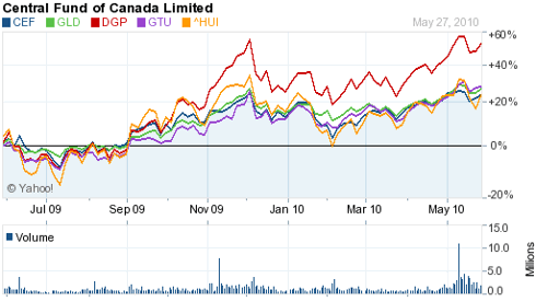
Gold stocks are a good way to take advantage of a climb in gold because they historically outclimb the metal by a factor of 2 or better. And the stocks tend to run in 4 year cycles of under/outperformance of the metal. They are just now finishing up about a four year under cycle. But there is an alternative. It's the PowerShares DB Gold Double Long ETN (DGP). This is not an ETF, it's an exchange traded note (ETN) and is a debt instrument. This has a big tax advantage as it isn't hit with the 28% longterm collectible rate as ETFs are - only the 15% rate as a stock would be. The recent performance of DGP vs the popular gold ETFs:
This is over a 2X outclimbing of the metal with the same tax treatment as stocks.
Monday, July 5, 2010
Gold's Value Chart ?
A common complaint about investing in gold is that you can't gauge any real value or use for it. As Warren Buffet said - they pay men to dig it up, then they put it back into a hole and pay men to stand around and guard it (paraphrasing). If you look at a stock, you can see its net income and dividend payout and, as a telling chart in one of John Bogle's books on mutual funds shows, this is a very good gauge of its rightful value. The chart goes back over the last 120 years or so and plots the sum of the constituent companies' eps and dividend vs the major stock index. The two curves form a DNA-like spiral and wind up at virtually the same destination after over 100 years of market turbulence ! Oh, would it be that we had such a gauge for the value of gold.
But wait a minute. Maybe we do. If you look at gold as having the purpose of being an alternative currency, you can compare the government printed monetary base with the government backing of that paper with gold. This is something that you can chart historically just as in the above chart for stocks. If you do, you see the following from an array of fascinating graphs at dollardaze.org
Here we see something like the DNA spiral for stocks around eps + dividend payout. Only the spiral seems to be around the confidence level in government printed money. There was a loss of faith in government in the 30s and gold wound up climbing to and overshooting the 100% backing level. There was a loss in confidence in the dollar in the late 70s, and gold again went to and beyond 100% backing. Now we are having a humdinger of a currency confidence crisis, and gold is extremely cheap on this value gauge - not even starting its trek to the other end of the range.
Thursday, July 1, 2010
A Ray Of Sunshine
A ray of sunshine on an otherwise dreadful market outlook is the condition of the transports and a key tech leader index. These rays really stand out in all the gloom. The debt dominos appear to be catching up with the rally from 2009. But before we bury the recovery, lets look at something important that is refusing to go along with the gloom so far.
If you put any faith in Dow Theory (and you should) you want to pay attention to what the transports are doing because for a move to be confirmed in the broad market, it must be replicated in the transports. Quite typically, a change in trend without transport confirmation turns out to be bogus. This has been a reliable indicator since the days when the rails were the main transport. In our day, rails have become much less significant, but recently have taken on the role of a reflection of the commodities market. Coal, and about anything you pulverise and haul, move much cheaper in quantity by rail than by smaller truck units getting 5 mpg in traffic. That's a major reason Warren Buffett is buying up railroads. If you look at how the rails are doing in this bad market (check CSX, CNI, KSU) you see they are still in bull climb mode despite the whacking commodites are taking. To isolate the transports as a reflection of purely economic activity apart from the global commodities market, I like to look at the Nasdaq transports because they are virtually devoid of rails:
Here you see pretty much the same thing as the rails show - they both are not confirming the change in trend seen in the S&P 500. The transports are proceeding on an upsloping 200 dma and may have put in a reversal stick on that trend line today. The retail RLX index has been leading the correction down and also has the look of a reversal day being put in at the bottom of a trading channel.
The leader groups, however, are mixed in their lead/lag condition. A nice one that is still leading is the semiconductor group:
The SOX also looks a little stubborn in going along with the Dow. These are the groups to watch. If they confirm the change in trend of the broad indexes, the market is on to its next phase.
Subscribe to:
Posts (Atom)