Sunday, March 20, 2011

Gold's Four Month Habit

Gold is a very fractal animal for whatever reasons, and its inscrutable repetitious habits can be taken advantage of. As investors, ours is not to reason why; ours is to profiteer off whatever we can as long as it's legal. With that proverb in mind, let's look at an odd habit gold has - the four month phases.

David Nichols emphasizes in his work that gold tends to make its moves in well defined time frames. In a February 27, 2009 article he wrote for kitco.com he describes one of those:

Although most of my work on market fractal patterns is concerned with the patterns and structures in price movement, there is also a clear time component to this amazing growth pattern in gold. Gold has been moving in 4 month units, with the hyper-growth phases -- and also the big recent correction -- consisting of 2 of these units, or 8 months.

This was clear in gold's behavior up to that date, and it certainly has been clear in its behavior since: (click to enlarge charts)


Here we see the pattern of a four or 8 month climb always followed by a four month consolidation. There are pullbacks to a nice, smoothly climbing, parallel set of 140 and 200 day EMA curves, which are the ideal buy points like clockwork. We just experienced one of these going into February. And the RSI dips to near 30 every time along with these trips to the 140, my favorite bull/bear reference. It's strange that we are just off all time highs, yet the RSI is moving around the 50 mark. The last time this happened was August 2009, and a powerful climb soon followed.

This all coincides with another time frame habit of another very related animal - the US dollar. It has an often noted 3 year cycle where approximately every 3 years it sharply dives to a new low. An excellent article on this is the one by Toby Conner in the 2/28/11 Financial Sense. The last new low was April/July 2008, and the really bad behavior of the dollar lately lends credence to Conner's projection of a dollar collapse to below the 2008 low of 70 - a sharp move from the 76 we're at now:


There seems to be a quandary over the safe-haven flight at this correction. Money doesn't want the dollar, as the above chart clearly shows, and bonds - well they are fast becoming a pariah. Cash is beginning to severely under-perform real inflation. That leaves gold and silver as the last safe-haven standing. So the 3 year habit of the dollar animal is matching up perfectly with the 4 month habit of the gold beast. How do these dumb animals know ahead of time what we shrewd humans are thinking?

Ours is not to reason why. If these creatures of habit live on, we are due for a major new profiteering gold climb starting in April.

Sunday, February 6, 2011

One More Canary

The leader groups in the market have been telegraphing the turns in the S&P 500 pretty well the last few years, and recently they have all held hands and sung a new song. I've written an article all about this What Tunes Are The Market Canaries Singing These Days ? over at Seeking Alpha, but since it's an exclusive to them, I can't post it here. I was remiss, however, in not pointing out one of the biggest, baddest canaries of them all, which I will do here.

This bad ass canary is the tracking of the cash levels of mutual funds. It is a contrary indicator because it depends on funds being the market, and if they are all in, the supply of dry powder for further upside gets pretty low. And for the last 40 years, that's about the way it has played out:

This history clearly shows the market was crusin' for a brusin' any time the cash level got down anywhere near 4%. This happened in 1972 in front of the '73/'74 beating, in early 2000 in front of the '00/'01/'02 beating, and in 2007 just in front of the '08/'09 beating. Well, Mister Market may want to brace for another assault and battery, because we are at around 3.5% now.

It should be noted that economic cycles are also very important, and each of these dips to below 4% happened in front of recessions. The only dip that didn't was the one in 1976, and the market's decline wasn't very bad after this cash level drop to around 4.5%. We currently are in an economic recovery cycle, so if we can avoid another recession, a market drop may not be so terrible.

Thursday, February 3, 2011

Nichols' Last Stand ?

The 64 month parabolic gold fractal as espoused by David Nichols in The Fractal Gold Report is entering a do-or-die zone the next couple weeks or so. As you know if you've been reading my posts, Nichols has been using fractal analysis to call the moves of gold to a high level of accuracy for years now. He says these moves are all within the context of a large scale parabolic growth fractal - the 64 month pattern that repeatedly shows up in big bull markets. This fractal must end in a parabola ending blow-off spike to around $2000 - and then the big collapse. The sprout point of this he reckons as September 2005, which agrees strongly with the silver chart; and the end of it is January 2011. Given that plus or minus a month is his tolerance for the pattern, and that other big scale cycles would have a flip occurring in gold from bullish to bearish by Feb 18, the finish line for the 64 month drama is just in a couple of weeks.

Well, where is the drama ? There is no drama ! Nichols first expressed puzzlement many weeks ago over gold's "delayed launch" and now must have a huge collapse immediately to mark the end of this 64 month growth fractal. Gold clearly isn't in any kind of 1979 style parabola ending mode. And it appears to be finishing up a pretty normal and orderly correction from overbought to oversold - as if it were tooling along somewhere in the middle of a bull market. No blow-off spike to a top and thus no big collapse. What's going on here ? How could a guy who has been getting the intermediate term moves in gold so right for so long be so wrong on the big overall pattern ?

Well, as I've been suggesting for awhile now, I think it is a matter of scale. My fractal posts basically say Nichols is right about the overall fractal pattern gold is in, but he may have the wrong scale of it in mind. As fractals are wont to do, they proliferate the same thing in all different scales. And gold may well be in the larger scale version of the 64 month iteration that Nichols has been focused on. I've given several examples from history of this bull fractal in my previous posts - it happens. And it seems to be happening with gold, as it did in gold's previous bull market of the 70s.

But Nichols has not recanted his 64 month doctrine - that apostate, that hard-necked heathen. As I've mentioned before, he used to be a true believer, saying in 07 and 08 that the commodity bull in general and gold in particular is the anti-fiat way to invest and has many years to run. Then he went astray with this January 2011 thing. He may have to come back into the fold, however, in two weeks. He more or less has drawn that line in the sand himself. From his February 1 Report on gold's action:

I have been pointing to a retracement up into the $1,355 to $1,365 zone to give us a clearer picture of this pattern, and the "tails" on the daily candles are starting to stack up just under this zone.

This seems like a set-up for an intraday foray up into the $1,355 - $1,365 zone that cannot hold into the close, leaving a long "tail" on the daily candle. This would not be a bullish development, as it would satisfy the requirement for a 38.2% retracement of the drop, but leave gold with a weak price pattern. If I had to guess, this is how I think it will develop right here.

The other alternative is a strong rally higher that holds up in this $1,355 to $1,365 zone through the close. But in my opinion it is going to take a close solidly over $1,365 to warrant taking baby steps back onto the bullish side.


He seems to be saying, "OK, if gold climbs back up over $1365 and doesn't do any February dive to oblivion, I was wrong about the 64 months". We'll take him back wholeheartedly into the flock of gold bulls.

Saturday, January 15, 2011

Bull Fork vs Bear Fork Comparison For Fractal Gold

The correction in gold this past week has gold fans trying to gauge its significance. About a month ago I posted on gold's big fractal fork in the road, and this correction is occurring right in the middle of the fork. So let's look at this fork. The two directions gold may take are a bearish path if we are in the 64 month bull market fractal (which ends this month, January 2011), and a bullish path if we are instead in a bigger scale of this fractal and are actually going into the mellow part of the 2nd parabola climb of this fractal. As I pointed out in my fractal fork post, the best way to discern which big fractal pattern we are in is the duration of the downtrend separator of the twin parabolas that make up the structure of this fractal. In gold's case, this downtrend is a little ambiguous as to whether it's the 1 year or less version that accompanies the 64 month fractal or the bigger 2 year or thereabout version that accompanies the larger scale overall pattern that seems to typically run around a 9 year length (plus or minus a year or so). To wit:


Here we see the inards of the larger scale bull-case pattern with the ultimately higher end price for gold with the 1 3/4 year separator. This would suggest a present pullback to about $1280 to a gently curving support area. This also is suggested by some technical analysis I ran across having nothing to do with fractals. Now for the bear fork possibility:


If you interpret the downtrend separator as this sharper, shorter version, it points to the 64 month as being the fractal we are in. The puzzlement with this is why haven't we seen the parabola ending manic spike in gold ? Well, if you subscribe to the popular train of thought that the big money bankers are to blame for suppressing the price of gold and silver to prevent panic over the dollar's problems, you would have to suspect that they were wary of what gold was starting to do late last year and perhaps did a total snuff-out of this spike. This is how the bankers think - Paul Volcker is on record as saying that one of the big mistakes made in the '70s was that they did not "manage" the price of gold better. This would leave us with just the collapse at the end of the 64 month fractal.

Which is the case should become apparent in a couple months or so. Just comparing the other examples of these various fractals, you see that in the shorter 64 month scale, the mid-course downtrend ends and the 2nd parabola starts usually right at around the 3 year mark. In the larger fractal, this usually occurs around 4-5 years. In our present gold bull, the 2nd parabola is starting at the 4 year mark. Even with the shorter downtrend, this puts it at over 3 1/2 years. And the 2nd parabolas tend to begin by overlapping the latter stages of the downtrend consolidations - this produces a disjointed curve in the shorter fractal version. These things, along with the bigger fundamental picture I discussed in the fractal fork post, seem to suggest that it's the bigger fractal that is in play.

But I am giving the smaller version possibility plenty of respect for now. Over the past week, I have done a serious re-weighting, taking a boatload of fat profits in gold to the sidelines for now. This would be prudent even if we are in the mellow early stages of a big 2nd parabola, where we will have typical overbought/oversold phases.

And it gives me an excuse to put more weighting into some good looking emerging sectors I've been lusting for - like agriculture. Some serious price action may be starting there as this food shortage article warns. It's a little melodramatic, but there have been a lot of trustworthy indicators pointing to some agri drama coming soon.

Sunday, January 9, 2011

Natural Gas: The 100 Year Bridge

Google "bridge fuel" and you will see a long list of discussions about natural gas being our bridge fuel to the future. I was using this term about nat gas years ago before it became something of a buzz phrase. Unfortunately, it's not creating the buzz it deserves - yet. Just what do they mean with this "bridge" talk anyway? Well, if you want a literal picture of "the bridge" here it is:


Here we see the cumulative global production charts for crude oil and natural gas up until the early 2000s with the Hubbert calculation for peak and decline. If you add NGL (natural gas liquids) to the natural gas curve, the green line actually forms a pretty even double hump with the oil curve - about 25 years apart. Historically, gas has been a Cinderella byproduct of oil production, but as the geometry of the above chart shows, it is now becoming the belle of the ball as conventional crude passes peak.

Nothing on the earth - solar, wind, batteries, ethanols, or algea - is going to come anywhere near matching the massive scale that natural gas is already providing in the years immediately ahead. This situation alone should cause nat gas to be the #1 alternative fuel consideration. In other countries, it is. But in America, congress and our president are going out of their way to ignore it in their drive to make the USA the global village idiot of energy policy.

I want to look at something that has happened to the bridge above. The chart was made before the advent of shale fracing and the huge reserve increases made from the Marcellus, Haynesville, Fayetteville, Barnett and other shale plays. As a result of this recent development, the 25 year bridge has become what many are calling a 100 year bridge provided to us by natural gas before we have to scale up a fossil fuel replacement team. These plays in North America are only a small part of this reserve addition. Schlumberger and other American drilling giants have developed the drilling method, so it is being put into use here first. But there are many shale areas around the world awaiting development. So globally, it looks as if we may have a big safe bridge ahead of us to develop alternative energy on.

This outlook, however, may wind up being a dangerous illusion. Natural gas drilling and recovery is subject to the same math that oil obeys with regard to net energy discussed in my post Oil: Beyond The Barrel And Over The Cliff. Making a producing horizontal well with intense water fracturing, separation and recovery is a very energy intense way of getting gas energy online compared to the way we used to do it. Even with the old fashioned drilling, we are running up against this EROI wall about now :


This net energy study was done by Jon Friese, a software engineer in Minneapolis as part of his volunteer work with Twin Cities Energy Transition Group. He used Canadian data because they provide much better well data than our energy policy challenged US counterpart does, but by indirect comparison measures, he thinks pretty much the same thing is going on with drilling on the US side of the border. If you consider the "cliff" location to be the 3 to 4 zone of the EROI ratio as shown in my post, this drilling picture has us rushing there in just a few short years. Obviously, we need such a study for the shale drilling, but considering that it is more energy intensive than what is shown, the chart would likely look just as scary.

We have exponential problems we are coming up against long before we reach the end of the 100 year bridge:


Here I graphed what the number of rigs would have to look like on top of the gas production per rig chart as it follows a fitted straight line per past data collected by Baker-Hughes. Just to keep production flat, you have an exponential curve develop as per rig production declines. We will have to come up with new technology and operations that jar us away from this geology induced straight line descent, or we will be forced to punch holes in rock like crazy to meet energy demand. Will shale drilling do that for us?

Despite the vast reserve additions being booked for our natural gas supply, there are real causes for doubt as to whether we will actually see all this energy feasibly produced. Over at the energybulletin.net and the oildrum.com Arthur Bermin has an article Shale gas: Abundance or mirage: Why the Marcellus Shale will disappoint expectations where he makes this bearish statement on the nat gas companies:

Shale gas plays in the United States are commercial failures and shareholders in public exploration and production (E&P) companies are the losers. This conclusion falls out of a detailed evaluation of shale-dominated company financial statements and individual well decline curve analyses. Operators have maintained the illusion of success through production and reserve growth subsidized by debt with a corresponding destruction of shareholder equity. Many believe that the high initial rates and cumulative production of shale plays prove their success. What they miss is that production decline rates are so high that, without continuous drilling, overall production would plummet. There is no doubt that the shale gas resource is very large. The concern is that much of it is non-commercial even at price levels that are considerably higher than they are today.
He states that profitability is hard to come by at sub $5 gas, and he is not alone in saying this. An attendee of the Biophysical Economics 2nd International Conference wrote on his blog, greenerminds.com about a study of the Barnett Shale made by Bryan Sell comparing a conventional field to the shale field:

Recent studies have shown only 28% of these wells have been profitable, and Sell showed costs per foot drilled in the Barnett at $150, three times conventional well costs. Shale plays also tend to be much deeper than conventional wells, driving up per-well cost. The Marcellus and Haynesville plays are more difficult and deeper than Barnett, and cost per foot drilled is double or more what it is for Barnett.
Sell also had some net energy numbers to report on Barnett:
The EROI went from 84:1 in 2000 to 38:1 in 2007, and overall volume per well had also dropped to half over the same period. This trend suggests another halving in 7 years, a 10% decline rate. Despite initial positive EROI, Barnett will show lower EROI than the conventional PA play in about 10 years time.
If that's the case for all the shales, their EROI chart will look like the one above for conventional gas in just 10 years after they reach the stage of maturity that Barnett is at now - rushing to the edge of the net energy cliff.

Many analysts, including Jim Cramer, have pegged natural gas stocks as a next big thing. But they could be up against a pickle with spending a fortune for oil and other energy input costs to extract a product that is residing at near breakeven pricing with plenty of it on the market already. They may be in a chronic situation where they can mothball capacity to raise the gas price, put a small wave of it on the market until price declines force them back into mothballing again. There is plenty of gas there, but the energy and production costs may be an ongoing dilemma for decades.

I am a great fan of the Pickens Plan for natural gas energy independence for America. And I think natural gas is our best bridge fuel for getting us to the post carbon world. But the bridge may be shorter and shakier for us gas fans than we think.

Wednesday, December 22, 2010

Gold Is At A Big Fractal Fork In The Road

If you follow the new science of fractal analysis, you may be aware of the 64 month bull market fractal that I wrote an article on awhile back. David Nichols and others have been developing this method for years, and Nichols has identified this 5 1/3 year (64 month) parabolic growth pattern as being very prevalent in historic parabolic climbs. He is developing a method for general market analysis, but is focused on gold and silver right now as gold has been proceeding along a parabolic fractal climb since a fractal sprout point in September 2005.

Nichols has been calling the moves of gold on a monthly scale with amazing accuracy. His day to day projections are more hit or miss, but on the month to month range, his analysis is astonishing. For example, in his 2/25/08 report, he had been saying buy gold under $900. "The plan is to now to hold on to these long positions as gold climbs to the major target of $1010 over the coming weeks." He fine tunes his prediction: "There's a good chance it will overshoot the $1010 area and extend quickly up to $1040. But it may not survive for long over $1000 ... there is the potential for a multi-month top to develop after this push." So what happened ?


Whatever this guy's smoking, I want some. Nichols does pure chart analysis, but he is well aware of gold's basic fundamentals. In a September, 2007 statement, he says, "The most important investment theme for the next 10 years will continue to be the frenzy for tangible, hard assets ... and the best market to take advantage of this monumental trend is gold."

So here is where a fork in the fractal road is developing. Those of us who see a continuation of the currency/demand induced commodity bull market for years may have trouble digesting the 64 month bull market fractal that Nichols has recently posited as beginning with the parabolic sprout in September 2005 and abruptly ending in February 2011. It's enough to give a fiat money hater indigestion. In my article linked above on the 64 month bull fractal, I point out the amazing prevalence of this fractal - it's everywhere. And gold is showing all the signs of following this pattern. So do the world's debt and currency problems all go away over the next two months ? Does the commodity bull cycle suddenly end now ? Has Nichols changed his mind about the investment theme for the next 10 years ? In 2008, he stated "this bull market in gold should last for many more years." His 64 month gold fractal seems to contradict this.

As I show in my article, there are examples of this 64 month parabolic fractal not ending a bull climb, but it presents some serious problems to the basic bull case for both gold and silver. Let's consider the basic phases of the gold climb, or any large scale parabolic climb. It is often described as three phases. Phase one is where the sellers have mostly had enough of the bear, and supply/demand slowly exert an upward bias, but there is little investor interest. Phase two is where professional investors slowly begin an allocation change back to normal levels, putting gold into a stable climb for years. Phase three is when the professionals have built an allocation level to around 5% to 10%, but the retail investor has yet to embark on the mania. Jim Rogers likes to ask his audiences how many are gold holders and at what allocation, and he is amazed at how few of these pros are holders to any extent. Early this year, the fund allocation level was estimated at around 0.4%. Jim Cramer reckons the pro ownership level now at still less than 1%, and he says that is way too low. The phase two pro accumulation is a slow process, as opposed to phase three. There was an interesting article over at The Daily Gold back on March 7 titled "Gold Is Not Going Parabolic Yet" where they note we're not even through phase two yet and even phase three takes time to build: "As the Nasdaq bubble proved, the seeds for a popular speculative mania are not sown overnight (or even in a few months). It literally takes years to prepare the soil of popular psychology for a mania." This phasing process, which is a steady acceleration into the parabolic top, does not fit well with the 64 month fractal and the gold parabola suddenly ending in February, 2011.

Another misfit in the puzzle is silver. In my article "Is Silver Money" I point out that every time in history where gold essentially becomes a currency, silver becomes valued, not per its industrial supply/demand, but at its abundance ratio with gold 16:1. If it goes there in this gold move, that implies a rise in silver to $150 if gold goes to $2500. Silver moves in parabolas even more so than gold, and you would think it would achieve this kind of price at the parabola's end. But the 64 month parabola constraint forces a rise from the $20s to $100 or more in just two months. That's asking a lot - even from silver. Silver's industrial supply/demand condition, by the way, has reached a truly historic point where the above ground stocks have been depleted to essentially zero compared to its run in the late 70s. Since then, a computer/electronics revolution has happened, placing immense demand on use of silver as the world's best electrical conductor. The artificial suppression by big money interests on the silver price has resulted in a long, long climb in the offing, more of a parabola than can be reasonably fitted into the 64 month fractal.

So what right does this fractal stuff have to upset the applecart of sound fundamental considerations ? Maybe we should just forget all about this fractal hocus pocus. Well, not so fast. Nichols seems to have only recently stumbled upon the 64 month thing. But just maybe there are other scales of this same fractal out there that we should be thinking about.

First, you have to consider the basic structure of this fractal. It is composed of two parabolas separated by a distinct downtrend phase about midway. For examples, look at the currency parabola of 1920s Germany and the stock market of Denmark in the 90s: (click on charts to enlarge)


The shapes of the components vary, but the structure keeps recurring with the downtrend in the middle being a year or less with the overall time within a couple months or so of the 64 months. This is by far the most common scale of this fractal. But it does seem to occur in other sizes. There is a 3 year version. As examples of this, look at Homestake Mining, the premier gold miner of the '30s, and the Brazilian inflation of the early '90s:


These fractals do the same thing in different scales. That's what fractals do. They are all different with the only common denominator being that all the main components are sized proportional to the overall size of the fractal. The 3 year mid-course downtrends are small, less than a year, and barely noticable; but they're there and much more clearly seen in the amplified versions of this fractal.

Could it be that there is a much larger scale of this same fractal that gold may actually be following in lieu of the common 64 month size ? Does such a thing exist ? It very well may. Look at these examples: the Thailand stock market of the late '80s and early '90s


The large size seems to cluster around about a 9 year length with everything scaled up including the variance on how long it runs and the duration of the downtrend in the middle, which runs around 2 to 3 years. The next example is the stock market of Turkey


This 9 year iteration has the mid-course downtrend run a whopping 3 1/2 years. This is also an example of a parabolic rise not meaning an end to a bull market as is commonly thought. The Turkish market could hardly be considered busted when the parabola was over. The next king-size example is the Australian dollar


Given that the downtrend size in the middle ran a little over 2 years, you get the impression it wanted to run to more like the 9 year length before being interrupted by the end of the world in late '08. A less pronounced version of this large size fractal was the Dow in the '50s


Big and gentle, this occurrence was not followed by a collapse, but by the big flat Dow of 1966 to 1982. A more typical large size was the Swiss stock market of the '90s


There is one other pertinent example of the large version of this fractal, and that was gold in the '70s. It featured a two year downtrend in the middle in 1975 and 1976. The length of this downtrend is about the most reliable predictor of which scale fractal is being carried out. The distressed buy and holders of gold during those two years would like to have known this basic fact back then. Well, we here in 2009ville know. This time around, the mid course downtrend gauge has been completed as of a little more than a year ago, and it was nearly two years, suggesting that it is indeed the large scale fractal we are in, replicating the previous gold bull


An 8 or 9 year scale of the fractal would make all the previously discussed pieces of the puzzle fit a lot better. It would allow silver to more reasonably return to an inflation adjusted peak commensurate with what it did in the late '70s


Here we see the larger scale mid-course downtrend size even more clearly to be the 2-3 year type, tightly correlated with the larger fractal.

So, should we fractal followers dismiss the 64 month parabola in our current gold market ? The investment implication of a blow-off parabolic top ending at 64 months is a hold of gold and silver going into January, and a serious round of profit taking after that. Then, if you are really bold, you could short gold coming hard off the end of the parabola. But this could be really dangerous because gold could sharply rebound at any time into a renewed bull market as the examples above illustrate. The implications of the larger size fractal are that we are in the early stages of the 2nd parabola, where you probably just want to take positions in the good miners and not try to be too cute timing around the shorter term moves in the gold price.

But what if you're not sure, and we are at a gigantic fractal fork in the road ? Well, it may be wise to closely monitor the technical condition of gold these next two months, and fade the sector if there is any serious breakdown beginning. Any such move should advertise itself in the appropriate technicals. But there couldn't be the end-of-parabola collapse if there is no end-of-parabola blow-off topping action. And, well, we are getting long in the tooth for such action to begin here at the end of December. The price action now in gold is quite orderly. Nichols is now referring to "the delayed launch" of the parabola ending frenzy per his current 64 month outlook. The technicals tend to favor the larger 9 year type pattern developing right now, but there is the very important fact that the 64 month is by far the most prevalent and seemingly most forceful version of the fractal. So maybe we should give it the benefit of the doubt until proven otherwise. It will be an interesting show to watch the next few weeks.

Friday, December 3, 2010

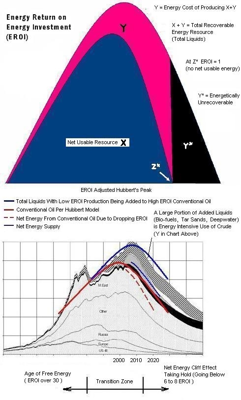
EROEI Adjusted Hubbert's Peak

As we again are coming up against the problems of peaking oil production, which may be coming off the end-of-the-world hold of two years ago, we should be studying the works of M. King Hubbert. Hubbert, a geophysicist, used empirical math to quantify the actual behavior of oil fields as opposed to all the geophysical theory that was his industry standard. His predictions differed from the industry, and this earned him the undying derision of his colleagues and indifference from the rest of the world. But his projections have been transpiring in history very close to his time-tables.

What his global model for conventional crude production did not account for was the radical decline in net energy as peak is passing and what happens after that. Net energy was not a concern back in the 1950s, when he did his work. But knowing what we know now about EROEI (which isn't near enough) we could perhaps take the liberty of estimating a net energy adjustment to his basic global curve. It would look something like this: (click on graph to enlarge)


The first chart is the basic effect of net energy on the peaking curve. As you can see, it is a nonissue for the many, many years coming up to the peak. But as peak is passed, it fast becomes a really big deal. That's what we, particularly in America, are going to be gradually waking up to in the coming years. And I'm afraid it will be a little too late. We may be dealing with chronic 3 digit oil pricing before we learn to deal with EROEI.

As the time frames above show, we could be going into a net energy collapse (to the Z* point on the graph) long before actual oil production declines very much.

This makes the net energy numbers on all our nonconventional crude additions that we are tossing on top of the total liquids curve very critical. It will decide where the narrow blue curve in the graph above runs, either with low EROEI and close to the red dashed line, or with high EROEI and close to the fat blue line of the total liquids production. The science of EROEI has come on to the stage and it will either be the villain or the hero. Our Congress is doing all they can do make it be the villain.