This is over a 2X outclimbing of the metal with the same tax treatment as stocks.
Saturday, July 17, 2010
Levering Gold's Climb
Gold stocks are a good way to take advantage of a climb in gold because they historically outclimb the metal by a factor of 2 or better. And the stocks tend to run in 4 year cycles of under/outperformance of the metal. They are just now finishing up about a four year under cycle. But there is an alternative. It's the PowerShares DB Gold Double Long ETN (DGP). This is not an ETF, it's an exchange traded note (ETN) and is a debt instrument. This has a big tax advantage as it isn't hit with the 28% longterm collectible rate as ETFs are - only the 15% rate as a stock would be. The recent performance of DGP vs the popular gold ETFs:

This is over a 2X outclimbing of the metal with the same tax treatment as stocks.
Monday, July 5, 2010
Gold's Value Chart ?
A common complaint about investing in gold is that you can't gauge any real value or use for it. As Warren Buffet said - they pay men to dig it up, then they put it back into a hole and pay men to stand around and guard it (paraphrasing). If you look at a stock, you can see its net income and dividend payout and, as a telling chart in one of John Bogle's books on mutual funds shows, this is a very good gauge of its rightful value. The chart goes back over the last 120 years or so and plots the sum of the constituent companies' eps and dividend vs the major stock index. The two curves form a DNA-like spiral and wind up at virtually the same destination after over 100 years of market turbulence ! Oh, would it be that we had such a gauge for the value of gold.
But wait a minute. Maybe we do. If you look at gold as having the purpose of being an alternative currency, you can compare the government printed monetary base with the government backing of that paper with gold. This is something that you can chart historically just as in the above chart for stocks. If you do, you see the following from an array of fascinating graphs at dollardaze.org

Here we see something like the DNA spiral for stocks around eps + dividend payout. Only the spiral seems to be around the confidence level in government printed money. There was a loss of faith in government in the 30s and gold wound up climbing to and overshooting the 100% backing level. There was a loss in confidence in the dollar in the late 70s, and gold again went to and beyond 100% backing. Now we are having a humdinger of a currency confidence crisis, and gold is extremely cheap on this value gauge - not even starting its trek to the other end of the range.
But wait a minute. Maybe we do. If you look at gold as having the purpose of being an alternative currency, you can compare the government printed monetary base with the government backing of that paper with gold. This is something that you can chart historically just as in the above chart for stocks. If you do, you see the following from an array of fascinating graphs at dollardaze.org

Here we see something like the DNA spiral for stocks around eps + dividend payout. Only the spiral seems to be around the confidence level in government printed money. There was a loss of faith in government in the 30s and gold wound up climbing to and overshooting the 100% backing level. There was a loss in confidence in the dollar in the late 70s, and gold again went to and beyond 100% backing. Now we are having a humdinger of a currency confidence crisis, and gold is extremely cheap on this value gauge - not even starting its trek to the other end of the range.
Thursday, July 1, 2010
A Ray Of Sunshine
A ray of sunshine on an otherwise dreadful market outlook is the condition of the transports and a key tech leader index. These rays really stand out in all the gloom. The debt dominos appear to be catching up with the rally from 2009. But before we bury the recovery, lets look at something important that is refusing to go along with the gloom so far.
If you put any faith in Dow Theory (and you should) you want to pay attention to what the transports are doing because for a move to be confirmed in the broad market, it must be replicated in the transports. Quite typically, a change in trend without transport confirmation turns out to be bogus. This has been a reliable indicator since the days when the rails were the main transport. In our day, rails have become much less significant, but recently have taken on the role of a reflection of the commodities market. Coal, and about anything you pulverise and haul, move much cheaper in quantity by rail than by smaller truck units getting 5 mpg in traffic. That's a major reason Warren Buffett is buying up railroads. If you look at how the rails are doing in this bad market (check CSX, CNI, KSU) you see they are still in bull climb mode despite the whacking commodites are taking. To isolate the transports as a reflection of purely economic activity apart from the global commodities market, I like to look at the Nasdaq transports because they are virtually devoid of rails:


Here you see pretty much the same thing as the rails show - they both are not confirming the change in trend seen in the S&P 500. The transports are proceeding on an upsloping 200 dma and may have put in a reversal stick on that trend line today. The retail RLX index has been leading the correction down and also has the look of a reversal day being put in at the bottom of a trading channel.
The leader groups, however, are mixed in their lead/lag condition. A nice one that is still leading is the semiconductor group:
The SOX also looks a little stubborn in going along with the Dow. These are the groups to watch. If they confirm the change in trend of the broad indexes, the market is on to its next phase.
The Russell Indicator Is Looking Weak
Back on May 9, I wrote a post on a technical thing to watch about corrections. The point was that in all good corrections, the small cap Russell tends to lead the charge from the bottom of the pullback. I showed charts of this from corrections in bull climbs and also from the cases where the Russell lagged in bottoming - with a bear phase following for the broad market. Well in our present pullback, the Russell is not leading a charge from a bottom. It is not lagging and it's in better shape than the S&P 500, staying mostly above its 140 day ema and not turning the 140 and 200 to a negative slope. But that's about all you can say for it. The Baltic Dry Index, even with the ship overbuild problem it is having, had been in a nonconfirmation mode on China's Shanghai bear behavior, if you want to consider the Baltic as a Transport Index for China and you pay any attention to Dow Theory. But now it has taken a nasty sharp turn down. The RLX U.S. retail index has been a leader group in the climb from the recession bottom, but now it is actually leading the S&P to the downside ! Tech and the small caps are still wanting to lead slightly to the upside. The leaders are going to have to get their act back together soon to continue a market recovery. They look like the three stooges, seriously disjointed for now.
Sunday, June 20, 2010
How's That Smartphone Revolution Doing ?
About a year ago, Jim Cramer was going all bonkers about the great smartphone tsunami headed our way, warning investors not to miss the giant wave. He was saying at the time that the mobile internet was going to be bigger to us than the chip was to the computer and what the internet was to the computer. Well, the smartphone revolution is proceeding. But is that making for an equal or better story in the related stocks? Cramer is pretty tech savvy and picking the good tech stocks was one of his strong points as a fund manager. So when he instituted his Smartphone Index on 8/12/09, I was interested. He picked out 20 names, and I puzzled over why he didn't include some. So I made up my "supplemental" smartphone index. Here's how they've done:
Cramer List of Top 20
TLAB + 3.7%
ADCT -10.3%
CIEN +18.2%
TKLC -13.9%
CTV - 5.3%
QCOM -22.9%
BRCM +34.0%
NETL +49.2%
XLNX +24.0%
SWKS +53.3%
RFMD -11.1%
ONNN - 7.3%
CY +0.7%
TSRA -28.4%
SNDK +185.5%
CSCO + 8.3%
GOOG +8.9%
RIMM -15.0%
PALM -57.8%
AAPL +61.8%
_____________
average= +13.8%
My Supplemental List
WRLS +15.2%
NTE -17.9%
ARMH +115.3%
CHA - 1.5%
SYNA +6.0%
CHU -10.6%
OVTI +73%
AKAM +137.5%
CREE +104.0%
ERTS -21.9%
STX +24.8%
LLTC +13.2%
____________
average= 27.5%
The Russell 2000 is up 16.8% over this same time and the QQQQ is up 18.7%, outclimbing the Cramer Index. I guess my +27.5% means I'm roughly twice as smart as Cramer. Now if I just had half his energy and charm.
My selections, given that I'm a tech idiot, were based more on cash flow history, valuation, and technical condition. This may infer that much of the smartphone technical particulars story may already be baked into the cake. It's hard to beat the market to the punch.
Cramer List of Top 20
TLAB + 3.7%
ADCT -10.3%
CIEN +18.2%
TKLC -13.9%
CTV - 5.3%
QCOM -22.9%
BRCM +34.0%
NETL +49.2%
XLNX +24.0%
SWKS +53.3%
RFMD -11.1%
ONNN - 7.3%
CY +0.7%
TSRA -28.4%
SNDK +185.5%
CSCO + 8.3%
GOOG +8.9%
RIMM -15.0%
PALM -57.8%
AAPL +61.8%
_____________
average= +13.8%
My Supplemental List
WRLS +15.2%
NTE -17.9%
ARMH +115.3%
CHA - 1.5%
SYNA +6.0%
CHU -10.6%
OVTI +73%
AKAM +137.5%
CREE +104.0%
ERTS -21.9%
STX +24.8%
LLTC +13.2%
____________
average= 27.5%
The Russell 2000 is up 16.8% over this same time and the QQQQ is up 18.7%, outclimbing the Cramer Index. I guess my +27.5% means I'm roughly twice as smart as Cramer. Now if I just had half his energy and charm.
My selections, given that I'm a tech idiot, were based more on cash flow history, valuation, and technical condition. This may infer that much of the smartphone technical particulars story may already be baked into the cake. It's hard to beat the market to the punch.
Saturday, June 12, 2010
Gold's Support Level
Gold is, in some ways, behaving like it should if it were down at a major support level. GLD is in a distribution phase, the bullish percent index is at the low end of the range, and gold is on a back burner in the financial media's programming lineup. But gold is not in any big dip right now. In fact, it's right at it's all time high ! This would not be right if gold's proper bull market support level were the typical straight line. But, geometrically, it's entirely proper if the applicable support level is a curve:

The bull market since '01 is turning parabolic according to many gold bugs, and the recent support level behavior tends to support that thesis:

At each of the three major resistance levels over the last several years, gold finds itself near the all time high, but not exactly the hot item as resistance merges with a parabolic support level. We're right about at that juncture now as the parabola steepens.
Fractal analysis doesn't look at trendlines, just fractal dimensions, energy levels, and self-similar patterns. So it is a somewhat independent means of analysis. It's interesting that the fractal forecast last July called for a major surge to the upside (which happened) and is now calling for another such surge.

The bull market since '01 is turning parabolic according to many gold bugs, and the recent support level behavior tends to support that thesis:

At each of the three major resistance levels over the last several years, gold finds itself near the all time high, but not exactly the hot item as resistance merges with a parabolic support level. We're right about at that juncture now as the parabola steepens.
Fractal analysis doesn't look at trendlines, just fractal dimensions, energy levels, and self-similar patterns. So it is a somewhat independent means of analysis. It's interesting that the fractal forecast last July called for a major surge to the upside (which happened) and is now calling for another such surge.
Thursday, June 3, 2010
What Is The Commodities Slump Telling Us ?
Commodities, if you haven't noticed, have broken down into a terrible slump, now far below the CRB's 140 day ema. This is rightly interpreted to signal a recession dead ahead most of the time. Add to this the pronounced slump in the ECRI's leading indicators, and you would have to say we're cycling into another recession. The ECRI slump was the subject of an article at SA on May 28 by Michael Shedlock. It shows an ominous 1 year dive in what usually precedes a recession.
But if you step back and look at a bigger view, you see another interpretation:

This multi-recession chart is also shown in the article (with the notes in black added) and shows a typical breaking of the "speed limit" coming out of a bad recession and then a moderation to a more steady speed going into the expansion cycle. The ominous 1 year dip would appear to be this moderation phase in the cycling.
You see something similar in the just released Journal of Commerce JOCSINDS indicator in the 1 year time frame. But if you click "chart the performance" for this recovery speed measure, and click on the 5 year view, you see pretty much the same moderation pattern as in the ECRI chart above.
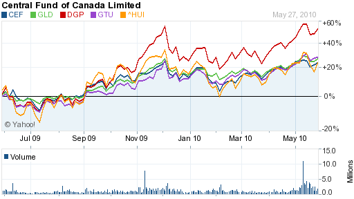
So why are commodities looking so bad? A moderating, stable recovery should be just fine for them. Well, you may not have to look any further than the US dollar chart to explain this. Commodities and the dollar are strongly correlated inversely. There has been something of an aberrant, monster rally in the USD in the face of the European debt turmoil. It's aberrant because the USD has all the same problems as the euro. What happens when the dollar rally fizzles? For now, the rally has correlated to a big dent in what would be a normal, strong recovery in commodities: (click on charts to enlarge)


Since the turn point at the start of the year, we've had a 17% rally in the USD and a 12% drop in the CRB. The two are not unrelated. Gold usually moves with commodities inverse to the dollar, but gold is climbing. And gold is coming to be viewed as an alternative currency. What's happening with commodities is mostly a currency thing, not an economic cycle thing. China's Shanghai index is in much the same predicament as the CRB. It has, to a large extent, been caught up in the slump of the euro because Europe is China's biggest export customer.
The currency thing is, of course, a debt thing; and that's a downer. So if you attach any predictive significance to current commodity performance, you would have to say it's forecasting debt domino problems, not problems from the normal economic cycles. The leading market groups such as the RLX, the Baltic Dry Shipping Index, the QQQQ, etc. all still seem to be positive. But the debt can they have successfully kicked down the road is another story and will continue to be a threat to derail all normal economic cycling until they pick up the can and fix it.
But if you step back and look at a bigger view, you see another interpretation:
This multi-recession chart is also shown in the article (with the notes in black added) and shows a typical breaking of the "speed limit" coming out of a bad recession and then a moderation to a more steady speed going into the expansion cycle. The ominous 1 year dip would appear to be this moderation phase in the cycling.
You see something similar in the just released Journal of Commerce JOCSINDS indicator in the 1 year time frame. But if you click "chart the performance" for this recovery speed measure, and click on the 5 year view, you see pretty much the same moderation pattern as in the ECRI chart above.
So why are commodities looking so bad? A moderating, stable recovery should be just fine for them. Well, you may not have to look any further than the US dollar chart to explain this. Commodities and the dollar are strongly correlated inversely. There has been something of an aberrant, monster rally in the USD in the face of the European debt turmoil. It's aberrant because the USD has all the same problems as the euro. What happens when the dollar rally fizzles? For now, the rally has correlated to a big dent in what would be a normal, strong recovery in commodities: (click on charts to enlarge)
Since the turn point at the start of the year, we've had a 17% rally in the USD and a 12% drop in the CRB. The two are not unrelated. Gold usually moves with commodities inverse to the dollar, but gold is climbing. And gold is coming to be viewed as an alternative currency. What's happening with commodities is mostly a currency thing, not an economic cycle thing. China's Shanghai index is in much the same predicament as the CRB. It has, to a large extent, been caught up in the slump of the euro because Europe is China's biggest export customer.
The currency thing is, of course, a debt thing; and that's a downer. So if you attach any predictive significance to current commodity performance, you would have to say it's forecasting debt domino problems, not problems from the normal economic cycles. The leading market groups such as the RLX, the Baltic Dry Shipping Index, the QQQQ, etc. all still seem to be positive. But the debt can they have successfully kicked down the road is another story and will continue to be a threat to derail all normal economic cycling until they pick up the can and fix it.
Subscribe to:
Posts (Atom)